x3FadingLove
Banana and Elephant ► Graphic Review Shop [Close]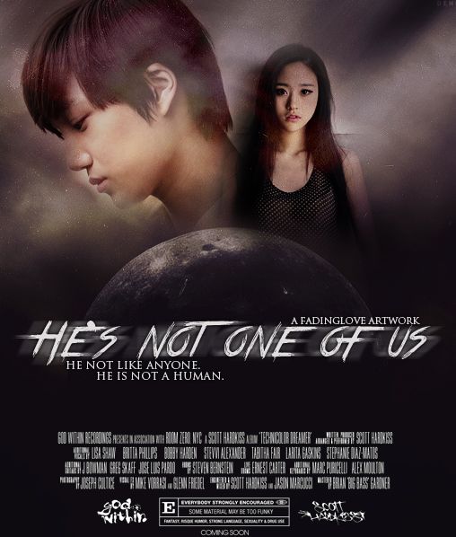
First Impression (8/10)
At first look, I have to say I'm really impressed. I like that shining texture. I love that. And then my eyes suddenly wandered around the faulty parts but they were minor but I love the poster over all altough I think it did lack something.
Mood/Genre (8.5/10)
So from what I could gather, the poster's genres are fantasy and a little action and romance but you didin't state the genre but if you're trying to portray the genres stated above well, good job. I love it, like I said before, I also love the shining texture. I helps enhance the poster.
Technique (16.5/20)
The blending on the poster is pretty good. Some stuff did bother me though. 
So the light background of Kai's picture is pretty disturbing and the background of the girl is disturbing too. Sometimes, showing the background could either make or break the poster and in your case, the latter. Maybe you could blur it or smudge it or erase it to blend it to the poster more. Other than that, I have no problems.
Pictures (3.5/5)
I like the pictures you used for the poster. I think both Kai and the ulzzang (Baek Su Min right?) both have the right expressions on. I like how Kai is facing left and the girl on front. It suits the poster. Although, I probably have mentioned it before but you could have choosen a photo of Kai that is easy to work with in a dark poster. Also, the stock you used - it's supposed to be a planet right but to me it seems like the moon otl. It's probably just me but if I were you I'd use these type of photos because they kinda tell a story you know. Like the first one - the earth is like looking over another planet - it could be a planet where Kai came from or the second, planet is like looking on a very bright star then that bright star is located near earth and instead, Kai's spaceship landed there. otl I need to shut up: 

Quality (4/5)
I love the quality of the poster. It doesn't need sharpening, it's lovely. Great job.
Coloring (6.5/10)
To be honest, I don't think much coloring was done. Adding a coloring could add a great impact to the poster. Let me try adding a PSD, here's the result (I also add a little sharpening):
See, that's a little better.
Placement (11.5/15)
I have no objections to your placements except for the movie credits . I think they're too big and they consumate most of the poster because after looking at the faces of the characters my gaze would directly go at the credits and we don't want that. The sole focus of the poster should be the characters and stock but then you put them on the top half of the poster while on the bottom half was the movie credits and well, I understand that if you remove them the poster would look empty. You don't have to remove them, just make them smaller.
Resources (13.5/15)
I really like your resources used. Especially the texture that shines (idk if it shines to you but it shines GREATLY to me). OTL I keep repeating this. hahaha but I seriously love it, it was well-used and it contributes to the poster greatly. Although, I would have erased the part where it meets the girl's face and Kai's nose but they looks good over-all. BTW, can you please link the texture? otl You don't have to if you don't want to but you know... I really like it.
Typography (3/5)
I love the fonts you used for the quotes and the artwork credit. It looks simple yet elegant and sophisticated at the same time. I don't like the font you used for the title - it looks messy. I would have used the same font as the quote to the title. I like how you motion blurred it but you just chose the wrong font.
Bonus (5/5)
Hey, thank you for requesting a review from me! I really like your poster. Also, the story where it was based off sounds interesting. ^^ Keep up the good job. I hope I didin't offend you.
Total: 80/100
Reviewed by: khlozzer
Comments