Nesnesa
Banana and Elephant ► Graphic Review Shop [Close]
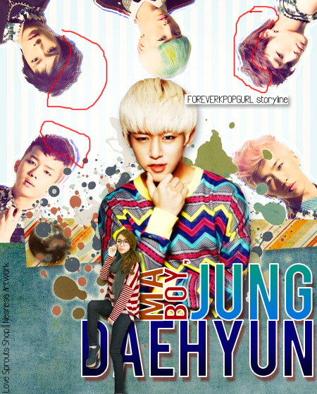
First Impression (7/10)
It looks very nice. It also looks clean and messy at the same time but I don't really mind. Also kudos for fitting seven people in one poster. Some things disturbed me though but we'll get to that later.
Mood/Genre (7.5/10)
You have captured the mood of the story well. Good job.
I deducted 2 points though. A lighter color of the splatters on the background would have helped enhancing the mood of the poster. Also, the pictures used are kinda serious so I'm just assuming that the expression on the characters' faces is relevant to their roles played in the story.
Technique (15/20)
The cropping is really nice but you could see jagged lines on their hair - understandable since hair is the hardest part to crop.
And, also about the hair (and shirt), you could see white lines (as shown below):
So what I did to make them dark, i used the burn tool. So here's the result (otl I forgot to burn Zelo & Himchan's shirt. See, there's also that white something there) :
Pictures (3.5/5)
The pictures used fitted the poster well. Like I said before, kudos for fitting seven people in. Although, is it really necessary to add the other members of BAP? Maybe they do have a part of the story but maybe, by removing them, it would have saved space but it's fine the way it is. I like how the girl's picture is small and is sitting on the title. otl
Quality (4/5)
The quality is okay but it could be sharpened more. Here's the result if sharpened more: 
Coloring (7.5/10)
I don't think you applied a PSD but it would have helped the poster's enhancement. But to be really honest, the poster is nice as it is. But here's the result when applied with PSD (I didn't make it, I just combined 2 PSDs and removed some stuff): 
Placement (11/15)
Like I mentioned before, kudos for placing seven people in one canvas. And , yet again, like I said before, the poster looked clean and messy at the same time. The placement of the title is perfect but lower left side of the canvas is looking pretty empty. I'm pretty disturbed about where you put the credits. Maybe you could use the same style as what you did with the author's name to the designer's name and place them on the lower left of the poster so it would look less empty.
Also, try erasing the splatters on Yongguk's face - it looks pretty disturbing.
Resources (12/15)
The pattern (blue and white stripe) you used on the background of the other BAP members can't really be seen - I need so squint hard to actually locate them. I love the PNGs used although instead of splatters, I would have used swirls instead. I also like the blue-green texture (is it a denim texture?) on the lower half, it complimented the other resources used.
Typography (3.5/5)
The font you used on the tile is pretty simple. I think they suit the poster well but a cuter, more playful font would suit the poster better - try Lobster/Badaboom(they are also simple fonts but they will contribute to the theme of the poster). Also, i think the shade of blue you used on 'Daehyun' is too dark, try a lighter shade or a different color like pink or yellow. I probably said something before about the credits so look it back, please, I'm too tired. lol sorry.
Bonus (5/5)
Yay! You're the first requester and my first graphic review so five points for you! lol.Ii hope you find the review helpful. English is not my first language but i hope you understand the review.
Total: 76/100
Reviewed by: khlozzer
Comments