[G.R.] sakuraciel
§orarius★§hop || ARCHIVE
pickup
TITLE: Bloody Heirs
MOOD: Dark, Mystery
REVIEWER: sorarius
REVIEWED FOR: sakuraciel
FIRST IMPRESSION & OVER ALL QUALITY (8/10)
It’s good, and I’m kinda wondering what this poster telling the story about. Yet I’ve just know that the genre is dark and mystery, so I think it delivers the story quite well.
RELEVANCE & THEME (8.5/10)
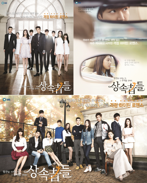
It’s dark, and as I’ve told above, I can get the ‘mystery’ mood from this poster. From the title, ‘Bloody Heirs’, it sounds dark and mysterious as well. I’ll only give notes to the ‘heirs’ word. Though overall of this poster is adequate and represent the story enough, I suggest you to enhance the meaning of this ‘heirs’ maybe by adding some glamour aspect if it’s necessary—or maybe by changing the window picture into a more glamour one? I give you some references from ‘The Heirs’ drama poster (well even though that drama story is quite bright, I only taking note of the theme ‘heirs’). From these three official posters of the drama, we can see they had some glamorous object on it, thus it represents the meaning more though they seem simple. :)
CHARACTER DELIVERY (9/10)
Jieun in her anxious expression and Yongguk in his badass expression—I think you have chosen the picture materials well for this poster.
HIERARCHY (3/5)
Though Jieun’s picture seems a lot contrast compare to another side of the poster, I think this poster is a bit too dusty thus the dust texture somehow hides this poster’s charm. I’m sure if you erase the texture in some essential part of the poster, it might look stand out more.
TECHNIQUES (8/10)
You seem the type who like to do blending by using a whole picture material then blend them including the background as well rather that cut/crop the only character/iconic picture, don’t you? (by the way, I’m kinda do the same to most of my artwork as well :D) I want to compliment your techniques to keep some of Jieun’s picture background because by that way, the overall poster looks balancing. Again, I have to note that the dust texture is somehow annoying (especially on Yongguk’s face and the title text) and make the poster looks dirty.
ELEMENTS (4.5/5)
The elements you use in this poster are representing the story adequately so I give a quite high score here. If you put another element to emphasize the word ‘heirs’ more, I think it will be perfect.
TYPOGRAPHY (5/5)
The font type, size, color and the technique you used are nice. The way you make the word ‘bloody’ a bit blur and let the ‘heirs’ word stay as it was literally making sure that ‘bloody’ is an adjective and ‘heirs’ is noun and the main subject/object in this story.The font type, size, color and the technique you used are nice. The way you make the word ‘bloody’ a bit blur and let the ‘heirs’ word stay as it was literally making sure that ‘bloody’ is an adjective and ‘heirs’ is noun and the main subject/object in this story.
COLORS (8.5/10)
Over all, it’s nice. But I think Yongguk’s face is too dark comparing to Jieun’s face. If you make him a bit brighter maybe it will look better.
PLACEMENT & BALANCE (8.5/10)
The placement is good, and the entire elements you put in this poster balancing each other well. If only you decrease the opacity of the dust texture, I think it will look better. Because, behind the dust texture, I think the poster is already balanced by the way you put brighter side of the poster on the top side, and the dark side in the bottom. It’s theoretically and practically correct since ‘darker’ means ‘heavier’ and ‘brighter’ means ‘lighter’, thus it will be balanced when heavier thing is below the lighter one. But unfortunately, the dust texture makes the bottom part of the poster bit lighter. Yet, this texture makes the poster looks a bit lively. So it will be nicer if you just decrease its opacity, not to delete it. :)
DOMINANCE & EMPHASIS (8/10)
It’s a good point that Jieun’s and Yongguk’s appearances look stand out. Yet I have to regret that the dust texture somehow hides the charm of its title text.
HARMONY & RYTHM (7/10)
Hmm. This poster is good enough, but I think it seems too monotone/static. Maybe you can put some harmony and rhythm on it by tinkering the dust texture. You can experimentally try to make it protrude in some part and lessen it in some other so the poster will be looking lot lively.
UNITY (3.5/5)
Everything is okay and blend well, except for the dust texture, sorry. :)
TOTAL SCORE: 81.5
REVIEWER NOTE: I'm very sorry for this late review and sorry if I sound rude. >< Hope you'll satisfy by the review.^^
Comments