[G.R.] ChemicalLuvs
§orarius★§hop || ARCHIVE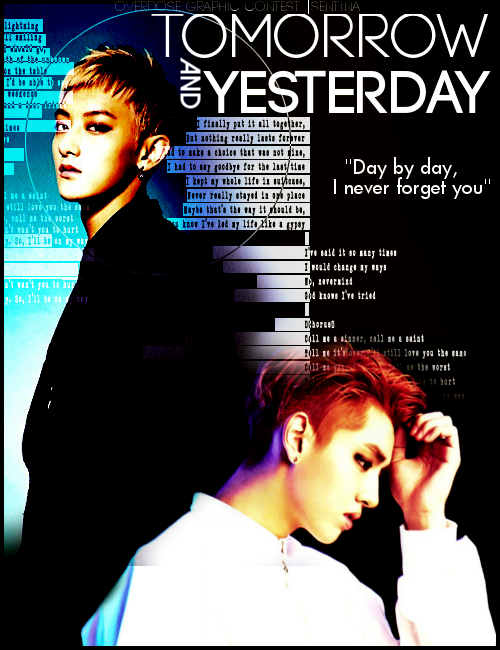
pickup
TITLE: Tomorrow and Yesterday
MOOD: Angst
REVIEWER: DanielArmandLee
REVIEWED FOR: ChemicalLuvs
FIRST IMPRESSION & OVER ALL QUALITY (7/10)
When I first saw your poster, it gave off the feeling that you had a very good idea in your mind what you wanted it to be but when you got your basic parts of the poster in place, you just stopped and didn't polish it anymore. It looks decent. It doesn’t make me want to claw my eyeballs out but it was lacking. To compare it to the career of one of my favorite groups, it's like VIXX: It was well planned, the skills are not lacking, but there are a lot things that should have been done but was overlooked because it looked like a good idea anyway. It shouldn’t be like that when you are creating graphics. I would not go into detail here but I would try to elaborate more on the next sections where we break it down. Also, let it be known that I use Photoshop CS6 and not Gimp, so the terms I will use will be PS. But I'm sure there are Gimp equivalents. So yeah, rock and roll.
RELEVANCE & THEME (8/10)
The only thing that threw me off in the theme was the mood you gave. Yes, it was almost there. But not quite: Angst. Angst is too broad. I think it would be better if you said that the theme was action-drama? No? The font and the text texture that you used were clean and masculine. Although the mood was a bit misleading, overall I think your poster would work well as an action-drama kind of poster so I would analyze it as such. The title Today and Tomorrow was reflected well with the dichotomy of the poster. The use of contrasting colors (black and white, cool and warm) also goes well with the theme of Today and Tomorrow. I am glad that you used blending/masking as it is the proper technique to use in this type of poster. Rule of thumb: never use cutting unless it is romcom. As for the stock, the only stock you used are the main images and the texture which again suit the theme well.
CHARACTER DELIVERY (8/10)
I am giving this a 9 out of 10 because you really chose good pictures to begin with. I like that they are wearing similar outfits in black and in white as it plays on the theme of the poster. Kris has this far off look and he looks like he is regretting losing Tao. Tao on the other hand is the reason I slashed off one point. Although he is not smiling in this picture, it seems to me that his face is saying "I'm so done with you Wufan Kevin Kris Jiaheng Duizhang whatever you feel like calling yourself today. Don't call me till you brought me mah Gucci." or he could be a look of "Totally judging your polka dot pants." Now thinking about it, maybe that's why Kris looks upset on the picture? Because he didn’t have anymore money to buy Gucci to appease his panda and he can't borrow from Junmyeon no more since they are not in good terms now. Or maybe he was disappointed that Tao didn’t get that he was cosplaying as an ahjumma fan going to a death metal concert. Oh hell, now I think I'll give this an eight instead.
HIERARCHY (2.5/5)
Honestly if I put this poster side by side with others, I probably wouldn’t notice it since it's not bad in the literal sense or bad in the sense that CL wants us to think (you know? Bad as in jjangbak awesome?) It looks average, not in the average aff poster context. But average in that I instantly can see that the person who made this has some decent skills in photoshop but could improve a lot more. But since you've only done graphics for a year, I think you are doing good. My first edits when I first got my hands on photoshop were so terrible, I'd probably hire a squadron of missile carrying jets to annihilate anyone who tries to bring it up. So yeah, all in all, no need to worry about not being at par with tumblr people in graphics, it takes time, patience and practice (tumblr people have way too much time in their hands).
TECHNIQUES (6/10)
The techniques used in this poster were pretty basic: masking/erasing, blending modes and minimal (if any) levels adjustment. I give you a six because six is a passing grade but it could be greatly improved further. Now let's break down each skill or technique.
For your masking/erasing or what people in AFF like to call blending, I would say that it is pretty decent. As far as I see, there is only one spot that you overlooked masking out, which is Tao's layer overlapping on Kris' shoulder. You could see a horizontal line just before where the bluish tones on Kris' shirt ends. I like that the background is exactly the same as Kris' layer's actual background. Even better that it transitions seamlessly into Tao's lighter background. However, I am a little iffy about the masking of your texture above Kris' hair. I am not really sure if you should have kept it out of his hair or maybe use a different and/or lighter blending mode for the texture. The texture also overlaps with Tao's face but I think it is stylistic and not as distracting as the overlap on Kris' hair.
For the blending mode, I think there are only two at most layers that you used a blending mode other than normal. The black and white computer text texture and the circle around Tao's head. As I have said, I am good with Tao's side but it's a bit off in Kris' side. I think that you should lower the opacity of the texture on Kris' side as the black makes it stand out too much.
The levels of this picture is alright if we are going for harsh light and lots of contrast. And since I believe contrast is key to the concept or theme here, maybe that's a nice thing. However, I think you should have added more shadows to Kris, on the left side. Maybe you could add a gradient that goes from a shade of black to transparent, set it to a blending mode that would make it look natural and lower its opacity into a suitable amount. And/or you could make a new layer and paint in your shadows, this way you could control which parts you want to emphasize.
Other things you should have done:
Sharpening - Tao's picture is decent enough in terms of sharpness, the quality makes me think of old Hongkong action movie posters or DVD covers so it's passable. Although personally I like to make the skin flawless first then smart sharpen. But then again, thinking that I am reviewing this as an action themed poster, the additional graininess is okay. On Kris however, it's a total mess. It's like it was done half way. I'm not sure if you just slapped the images there and didn’t touch the blur or sharpen filters but as a rule your images should be of the same sharpness. Especially in this poster, everything seems to be sharp except for Kris. What does this mean? Did Kris die? Is that why he is in an ethereal glowing blur? I get the feeling that Tao is the tomorrow and Kris represents the yesterday part of the deal but really, the image could use a hell of a sharpening. If you meant Kris to be an ethereal entity who glows and fades out then why not just mask away some parts of him?
Coloring - Again, I am not really sure if you used any coloring or you just pasted your stock there and pray they jive well together. What I find off about the coloring here is the shadows and midtones. The shadows and midtones on Tao are too warm. Too friggin warm it burns. If you are old enough, you might remember the time when pictures from publications are printed through different screens, much like your printer stores different colors, and dispenses them separately. Now, sometimes the paper would be off centered and you could see that the reds or blues or yellows are not aligned with the overall picture. Tao's shadows feel like that. It was as if the red channel was off centered to the left, that's why we are seeing too much red and the yellow on his skin is way too much it should be politically correct to call racist on it. This would have been okay if Kris' shadows were of the same color but Kris has purple shadows. Or a blue lighting in his back at least. You should make it a point that like the sharpness, the color palette of your images is almost the same.
ELEMENTS (4/5)
I am good with the elements and make up of your poster, as I have said it has a clean plan. I like the stock you used. My only problem is that there is too few of it. I am all for minimalist posters and all but I can't help but feel that for a poster this noisy, it feels a little bare. You could have added a texture or two below Tao right beside Kris as I feel that's an awkward white space (it's a white space even if it's black… ugh… lame puns yespls) However with the few elements that you used, you have used them effectively so I'm just going to deduct one point for that.
TYPOGRAPHY (3.5/5)
I am very particular with typography and it is usually the last thing I decide on when I make graphics, having said that, you should be happy that I am giving you 3.5 points in this category even if you used very plain fonts. And yes, I am giving you a good mark for exactly the same reason, the font was plain. One thing about typography is that the fonts could look good on their own but they also should agree with one another. I usually suggest mixing serif with non serif fonts for variation but this also works. I like that your fonts are sturdy and legible. No styles or other nonsense, just straight forward and bold. But then again, I am also deducting a point for it being too plain. Also I am deducting half a point for the contest watermark. It looks like it could use some help on its weight. It disappears on some parts and there are parts where it's too thick. Anyway, good job still.
COLORS (8.5/10)
As I have mentioned earlier, the colors were okay. They are not terrible. Black and white with a splash of some warm colors with cold shadow tones. But again, too much red. Too much cyan. I wish Tao were a hell lot less colorful. I mean he has red, cyan and yellow and is highly saturated. Maybe you could turn down the vibrance or saturation? It would also be nice if the purple highlight on Kris' back was echoed on some other part of the poster as some kind of highlight. It would look really nice on the high contrast black and white theme going on. Again, I want to reiterate, for an angst/action poster, this had way too many colors. I am going to leave your color table here for you to ponder about.

PLACEMENT & BALANCE (10/10)
This one, I give you full marks. Like I said, I feel that the placement of the elements were well planned even if there were only a handful of them. I like that you didn’t just slap everything in the center like most are bound to do. The white space around the quote is very good. The placement of the main elements (the characters and the title) are well balanced. Since Kris is visually bigger and advances in sight due to his white shirt, placing the text near Tao who is wearing black and visually smaller is a good move. The poster has an invisible diagonal line that breaks it into two which kinda cashes in on the today/tomorrow concept that it has going on.
DOMINANCE & EMPHASIS (8.5/10)
I think that since the poster has very few elements, it is difficult to get off tangent on the emphasis. The main images which are Kris and Tao dominates in this poster. However I think because Kris is blurred and Tao is framed with a circle , the eyes instantly goes to Tao. And as you have guessed by now, I hated the colors on Tao. Also, I think Kris shouldn't be overshadowed in the emphasis because the emotion of this poster rely on his dramatic expression (this comes from a person who likes Tao and is not fond of Kris, you should listen). Since Kris is visually larger in this poster, he can pull the eyes but too much Tao worship is going on in this poster that it steals the focal point which is the look of regret on Duizhang's face. But since this is only a subjective interpretation of the poster's story, I am only deducting one and half point.
HARMONY & RYTHM (8/10)
Two thirds of the poster has a digital cadence and chaos feel going on while the bottom part is all glowing ethereal runway sadness. Overall and conceptually it has a gradually shifting rhythm and a good harmony in it. But of course the overly saturated leading to digital noise colors of Tao contrasting with the gaussian blur of Kris had to ruin that. It is just too much of a contrast. Also, using just one or two textures for this is playing it too safe. Maybe next time you should use more? You have a good sense of proportion and balance of composition so using more elements shouldn’t be a problem for you. All you need to know is how to properly use them. Play with different modes and opacities. You'll be surprised how five textures wouldn’t feel so crowded given the proper treatment.
UNITY (3/5)
Again, your elements are well chosen but the execution is what failed. Maybe if you colored it to look more uniform or just used a psd coloring, it would be a bit better. Again, next time make sure that your photos are of similar quality, sharpness and color scheme before rendering your graphics. Otherwise, the good placement and balance makes up for it a bit.
TOTAL SCORE: 77
REVIEWER NOTE: To sum it up, good job on the composition but you could use some work on your other skills. Again, practice and more practice. Read up on tutorials to learn new skills. I know that this was supposed to be reviewed by Ra, but she is swamped with other requests I guess. So I hope that this review was of help and not too rude. But really. Most of the time, I'm more rude. I just don’t want to get fired on my first review so I'm being nice lol. <3
Comments