[G.R.] fairykyu
§orarius★§hop || ARCHIVE
pickup
TITLE: Beautiful
MOOD: Supernatural
REVIEWER: sorarius
REVIEWED FOR: fairykyu
FIRST IMPRESSION & OVER ALL QUALITY (8/10)
Wow, I got the feel of fairytale world from this poster.
RELEVANCE & THEME (8.5/10)
As I said, I feel some kind of fairytale thingy from your poster, yet I’ve questioned of why the use of mysterious dark color for the background. And I’ve just noticed that you’re indicating the genre as ‘supernatural’ thus I went for, ‘oh, I see’. I mean, the way you showed on the meaning of ‘beautiful’ in a supernatural genre is uniquely correct.
CHARACTER DELIVERY (9/10)
The character you chose is already beautiful, and the addition of the peacock fur on her head adding the essence of ‘beautiful’ more. Though I’m questioning of what is she looking at. Is she thinking of something beyond?
HIERARCHY (3/5)
Though the bright flower texture makes a contrast effect with the background and making the character stand out more, I’m regretting of why you don’t sharpen the character’s feature and also the flower more. That way, I’m sure that this poster will look more noticeable and gives more of hierarchy. Whilst, the peacock fur texture looks more sharp than any other thing in this poster. Thus I suggest you to make the other elements (especially the main character and the flower) to be looking sharpened more than the peacock fur as the additional texture on this poster.
TECHNIQUES (7/10)
This poster’s making technique seems too simple. Not to belittle the techniques that you used, I’m just wishing of something more impressive since the theme is not something that simple as you explained it as ‘supernatural’. Maybe you can improve the essence by adding some other relevant elements or textures?
ELEMENTS (4/5)
Well, the elements you use in this poster are representing the story adequately so I give a quite high score. If you put another thing to emphasize the word ‘beautiful’ and ‘supernatural’ more, I think it will be more perfect. :)
TYPOGRAPHY (3.5/5)
I think the text ‘Beautiful’ this poster had is adequate, the font itself is beautiful already. But the problem is that the credit text in bottom is ‘too much’ and the font type didn’t match the theme this poster had. Moreover, it looks brighter than the main title text thus it looks protruding than the title text which ought to be protruding more than any other text element in a poster. I suggest you to lessen the opacity of the credit text or to choose another font type which is thinner than current font. Or maybe you can protrude the title text more by adding an ‘outer glow’ effect or else?
COLORS (8.5/10)
Over all, it’s nice. Honestly I don’t have many things to be said about this.
PLACEMENT & BALANCE (8/10)
The placement is nice, and everything is balanced so well. Yet, I feel it too balanced and too simple since everything simply put in the center of canvas. I wish you can play more with the balance in this poster by adding something here and there, challenging to unbalance it yet you still keep everything looks balanced thus the poster still looks nice but in more impressive way.
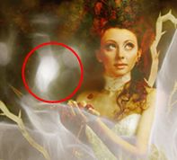
DOMINANCE & EMPHASIS (7/10)
The bright white flower texture and the female character in this poster indeed look stand out than any other thing in this poster. Yet I don’t see them protruding essentially as I notice a little thing on the poster bothering my sight. It was the bright white orb in the left side of the character’s face. When I try to focus on the girl’s face, that bright orb also caught my eyes and somehow swayed the focal point in the poster from the girl’s face to that orb. This is the same case as the main title text compared to the credit text, when I try to focus on the title text but the credit text stole to focal point. Lessening its opacity a bit may solve the problem. :)
HARMONY & RYTHM (7.5/10)
Thanks to the flower texture, the poster looks livelier by the difference bright intensity it had. The mist gives a bit magical/supernatural feeling. Though, as I said above, this poster is too simple and monotone for the theme supernatural.
UNITY (3.5/5)
Honestly, in my opinion everything is okay and blend well adequately, except for the font type (and opacity) of the credit text.
TOTAL SCORE: 77
REVIEWER NOTE: I personally love this poster~:) Yet when I take a closer look, I've some critism for some little things on it.
Comments