♦BOTTLEOFDREAMS
★Heartbreak Shop★| Busy |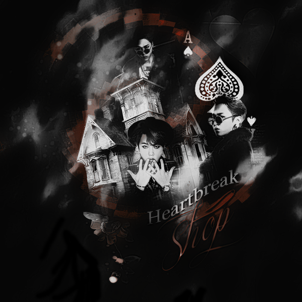
&gRăphiĉ rÉview'-
Impression (20/20) → It's definitely a beautiful poster. The pictures you have chosen fit very well with a fantasy-esque concept and the colors give off a somewhat enchanting vibe. Blending was also spot on.
Fonts & colors (18/20) → I love the typography, it fits the poster perfectly.The font you have used for 'Nameless' fits the fantasy-vibe perfectly. I also like the color you have used, it sticks out enough for it to be easily readable.
Overall coloring of the poster is also very nice.
Texture & stocks (17/20)→ I'm not the biggest fan of the 'grungy' texture that you have on the grey - or white, not sure, on my laptop it's greyish - parts of the poster. It is a bit overwhelming. Stocks were chosen well, I absolutely love the stairs on either sides of the girl.
Please log in to read the full chapter
Comments