The Boogeyman
Description
The Boogeyman can see you...
Foreword
A sequel to the horror story-Lone house.
I had the story in my mind but posted it due to a request from a reader-amarisvalemucho.
Impression and Overall Quality: 3/10
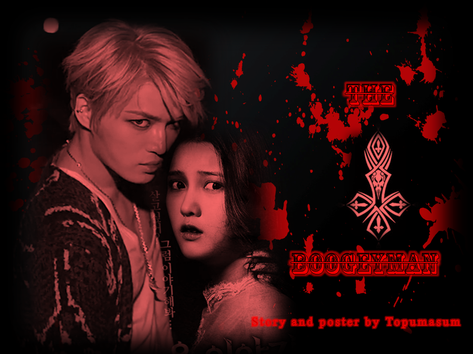
I think this is an interesting poster. I haven’t seen horror rendered like this before, so it was quite
refreshing to see. ^^ It is really messy and unpolished though, which we will talk about in the rest of the
review. It’s not really attractive, but I think some people could be lured into reading this because it’s
quite different from what you usually see as a horror poster.
Relevance and Theme: 7/10
I’m not getting too much of the story from your foreword or prequel (you should work on that).But I can
safely say that the poster is fairly relevant to your story, and does include some horror elements which
are good ^^ A mood is definitely present, but I’m getting more of a gory/less serious kind of feel to it
(kind of like those really lame zombie movies or something).Overall, I think you managed to capture the
theme well.
Character Delivery: 9/10
This part was done well thanks to Jaejoong’s (y) glare and OC’s face of fear. Jae is very convincing
with his psychopathic aura and I would even say he does look like a closet creature with that hideous
sweater /shot/. I also like how it seems like that is Jae’s hand on the OC’s shoulder. OC does bother me a
bit though, but that’s a personal opinion ^^
Iconography: 8/10
I think just from the title, many would be able to tell what the gist of the story is about. You haven’t
given too much of the plot away, perhaps save for Jae (the ‘boogeyman’) is probably preying on OC and
some blood is involved (?). I do like the hint of the skull/cross pattern between the titles, as it leaves us
thinking that there may be more to the plot and its involved somehow.
Images: 3/5
It’s quite obvious that the image you used for the OC is a different movie poster because the Korean
titles are still visible (plus I’ve seen that poster before). You can even see the edges where her image
ends. It would nice if you could edit it properly, or at least make an attempt to remove the letters. Other
than that, I don’t have any major problems; the pictures were chosen well!
Use of the Basic Elements: 7/10
The colors and brightness is a problem. I feel like it’s a bit too bright to be a horror poster. That tone of
red over the characters doesn’t sit well with me either; I’d rather prefer a dark red and black color
scheme. I don’t think the lighter background within the black border fits well either (make it all black or
at least one color).
Space is not a problematic factor, but I will discuss the use of line in balance.
Typography: 1/5
… Oh dear. I think this is one of the factors that make your poster a little on the unserious side. I don’t
think these fonts fit well with the poster, or any horror posters to be honest (to reference, it’s usually
used for circus type graphics). The strikethrough is not appealing at all. The split between ‘the’ and
‘boogeyman’ is not necessarily attractive either. Finally, it does bother me a bit that the author credit is
super distracting and even overlapping on the OC. Please reconsider your type choices~
Hierarchy: 3.5/5
Dominance and Emphasis: 8/10
Because of their difference in color and texture, the characters contrast against the background and it
makes them stand out. This allows them to be seen first, which is good for the hierarchy portion. I would
say that because the type blends in with the blood and background (and the fact that it’s a hard to read
text), it’s a little bit more difficult to notice. Generally I think your author credit is more legible than the
title, which isn’t exactly what you should be aiming for. I would say the emphasis on the characters is
fine though.
Scale and Proportion: 4.5/5
The size of the characters is perfect for making them stand out and take up a significant amount of
space. But the size of the characters to each other… I think it’s just her forehead, but OC’s head looks
really big in comparison to Jaejoong’s haha. I don’t think it’s a huge problem though. The title could be
bigger though, since it’s important.
Balance: 2/5
I do think the characters’ side of the poster is fine as they occupy the right amount of space. I wouldn’t
say the same for the other side. I’m 95% sure that the title is off balance between the two words. If it
isn’t, it looks like it is because the skull/cross pattern is off balance with the title. The author credit is off
balance too; basically everything on the right side is off balance TAT trust me, this will bother a lot of
people. A simple centering will do the trick.
Harmony and Rhythm: 8/10
The consistent use of red and black (alas different tones) is quite good for your harmony. But while
everything else is blurred and less sharp, the title does ruin the poster a bit (but I guess you knew that). I
do like the horizontal sense of rhythm achieved.
Unity: 3/5
It’s the title that ruining everything for you LOL it contrasts greatly with the rest of the poster, and not
really in a good way. Matching the color scheme would help as well!
Overall Score: 67/100
Poster reviewed by Jenday-nim
done by http://www.asianfanfics.com/story/view/542343/world-of-literature-review-shop-closed-finishing-requests-check-chapter-4-nomination-is-officially-open-request-review-reviewer-service-reviewshop
Comments