[TUTORIAL] Blending / Romance Poster! + Do's and Dont's
❥ The P H O T O S H O P Geek ❣ Photoshop tutorials; WE'RE BACK!!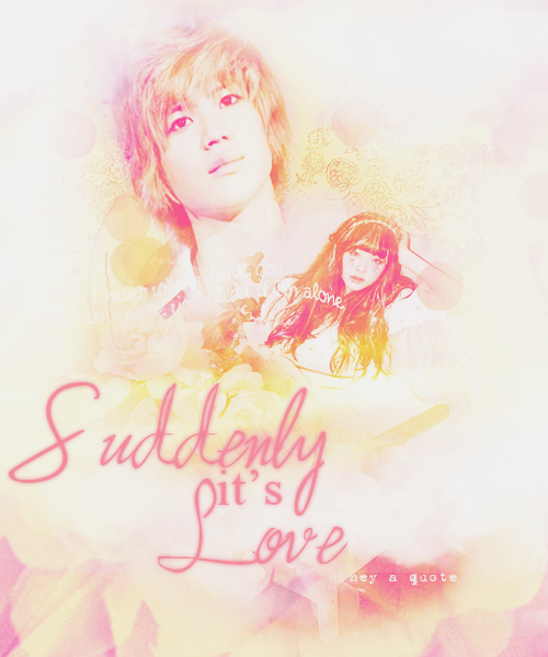
Blending/Romance Poster! + Do's & Dont's
I'm back again! XD thanks for forgotten- who requested this tut.
I told her that this gonna be in video but It turned out to be a fail! hohohohohoo!
I you guys know some good desktop recorder software please be kind and tell mo lol jk, please tell me my little unicorns!! -3-
*HERE IS THE GRAPHIC PSD FOR THIS TUTORIAL IT'LL HELP YOU MORE!! ;D**
^^CLICK THAT*
THINGS I USED:
Taemin oppar // Sulleng unnie // Texture // Texture 1 // Texture 2 // Texture 3 // Texture 4 // Texture 5
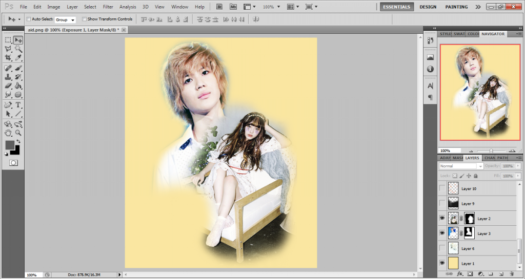
1) First create a new canvas mine is 500x600
2) Open your texture or background I'm gonna use a solid color for now the color is #f9d146. If you're gonna use a texture make sure you adjust it
on the right size but make it is not pixelated and stuuf. ouo
3) you can now open your photo to be use and paste it on your canvas. resize it if the photo is too big.
4) There are different types of blending though. But I'll just use the eraser tool make sure you usse the fuzzy brush.
5) before you move on erasing. click on the layer mask symbol first. It ison the lower part beside the 'fx' button.
6) You can now erase some of the parts of the photo. but make the head is not cut off or else it will be awkward and all OwO
Tip: Make sure you are not erasing the photo neh? make sure you erase on the White canvas thingy.
7) After the erasing you can now add your TEXTURES!!
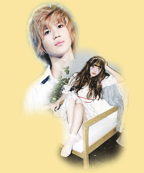
make sure you adjust it to the right adjustment..well... idk you can play with it
8) Add your Title quotes etc. place it anywhere you likeu~
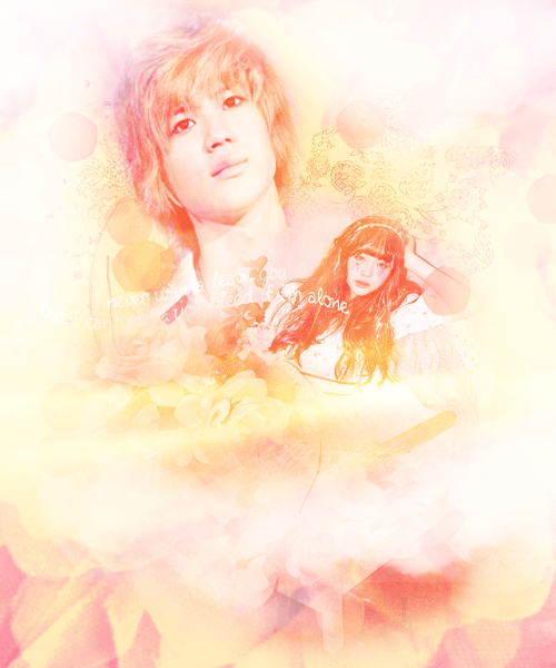
9) Add a PSD! yaaaaaaaaaaaaaaaah!
THAT'S THE TUTORIAL! BUT HERE ARE
'' THE DO'S AND DON'TS!!!''
FOR GRAPHIC DESIGNING BLENDING AD SUCH MORE~
DO'S
- MAKE SURE YOU CHOOSE THE RIGHT PICTURE FOR THE THEME. IF THE THEME IS ANGST COLORFUL AND SMILING ALIENS (PEOPLE) IS A NO NO! BUT IT REALLY JUST DEPENDS SOMETIMES A SMILING GIRL CAN BE APPROPRIATE FOR AN ANGST. WELL IF YOU REALLY JUST CAN PULL IT OFF THEN YEAH. BUT STILL. SMILING AND COLORFUL THINGS FOR ANGST IS A BIG N.O!
- ALWAYS GO FOR HQ PICTURES.
- CROP THE PHOTO PROPERLY SPECIALLY FOR CUTE POSTERS~ AND AS FOR ROMANCE AND ANGST AS I SAID EARLIER THE HEAD SHOULDN'T BE CUT OFF OR ELSE IT WILL BE AWKWARD AND STUFF!
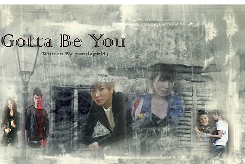
- MAKE SURE WHEN YOU BLEND. IT'S NOT TO DARK NOT TOO LIGHT. LIKE THIS BY THE WAY THAT'S MINE DON'T TAKE IT! xD.
- DO USE STOCK OR PNGS. FOR ANGST AND ROMANCE STOCKS AND TEXTURES ARE RECOMMENDED. AND FOR CUTE OR FLUFF PNG'S ARE BETTER! :D
- DONT USE A PICTURE THAT THE HEAD ARE CUT OFF. BUT STILL ITS UP TO YOU IF YOU ARE GOOD AT BLENDING AND HIDING! XD
- USE FONTS THAT ARE SUITABLE FOR THE THEME!!! THAT MEANS DONT USE A GRUNGE FONT ON A CUTE POSTER AND VICE VERSA! XD
- MAKE SURE THE FONT IS NOT TOO BIG NOT TOO SMALL.
DON'TS
- DONT USE SELCAS OR FANTAKEN PHOTOS. SINCE MOST OF THEM ARE NOT HD AND WILL TUIN THE QUALITY OF THE POSTER, WELL YOU USE SOME. UNLESS THE QUALITY AND ANGLE IS GOOD! YA KNOW WHAT I MEEEEEAAN???
- DONT MAKE THE SIZE OF THE POSTER TOO SMALL AS WELL AS THE FONT. I ALWAYS MAKE MY POSTER 500X600 BIG.
- DONT USE IMAGES THAT IS ALREADY EDITED.
- ALWAYS USE HQ OR HD PICS.
- WHAT WRONG WITH THIS IMAGE? FIGURE IT OUT. AND DON'T DO THAT!
- DON'T USE TOO MUCH STOCKS AND TOO MUCH CHARACTERS ON THE POSTER WILL MAKE IT MESSY AND STUFF. URGH!!
Comments