More Posters ^^

DarkPoster_zpsc53573a3.png?t=1369151675

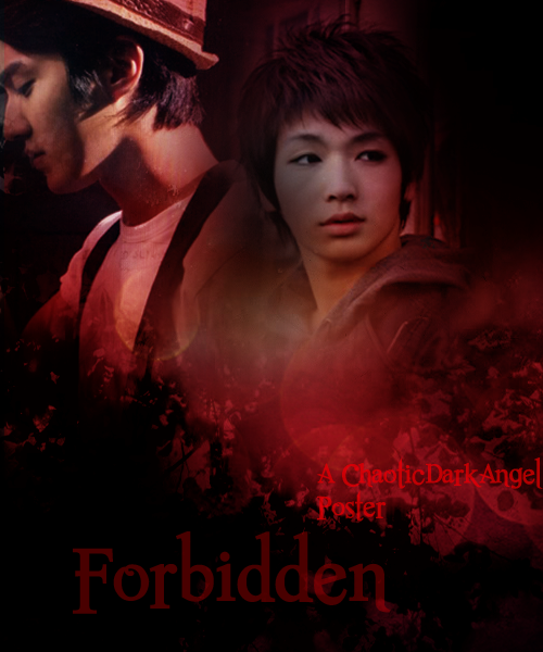
I'm actually kind of pleased with how this turned out. I was trying to create a border for it but-well the border didn't turn out well so I scrapped that idea ^^; Does it look okay if not decent? Is it too dark?


RomancePoster_zps227ef3d0.png?t=13691433

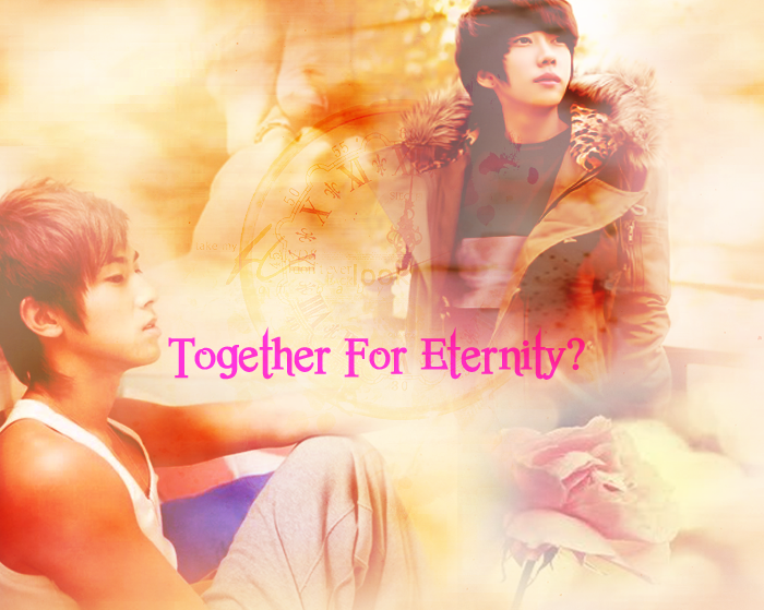
I'm on/off with this one ^^; I think I probably added a little too much stock images here. What do you guys think?


SoftAngstPoster_zps742df947.png

WinterFlower_zps305d03f6.png


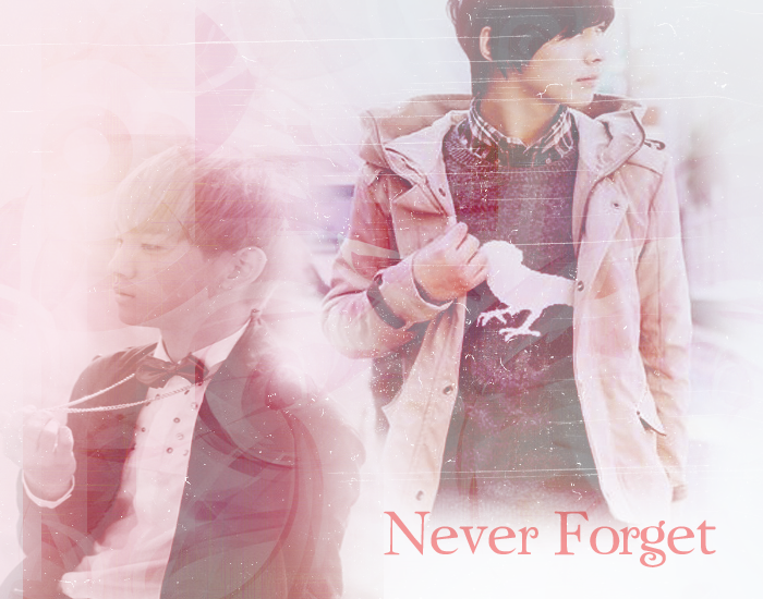
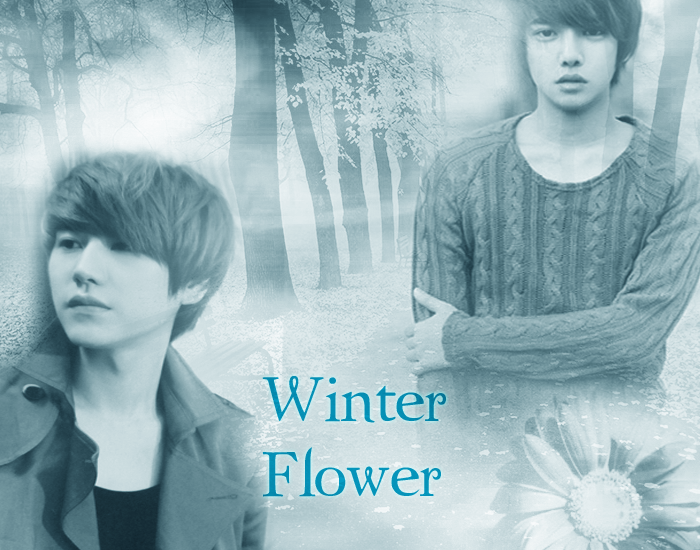
And...that's it I guess :3 Do they look okay? Have I improved somewhat or do I still need a bit more practice? I'm always open to advice ^.^ *rolls out awkwardly* The titles are all random by the way, not for actual storylines...well maybe.


Oh yeah: And do you guys know any good trailer shops on here? I'd kind of like, to have one for my fic but I have zero idea where to even start. Please and thank you :3

Comments

You must be logged in to comment
flowertea
#1
I love the second to last one! But they all share an awesome blend of creativity!
AptonKey #2
Loved the colours but make the characters a litre shade so they stand out
-white-
#3
It nice but...when you want to blur one of the picture inside the poster make sure yoi erase all texture around the character that you blur so it will looked more better^^ just giving some advise~
UknowMi
#4
Wow nice work unnie, practice more to improve more, ur doing great ^-^ and lessen the opicity of the upper layer, for the 1st and 3rd pic cant see much of the guy on the 3rd pic the one on the left ....But all in all thumbs up... Ur awesome ^-^