some graphics stuff pt.2
I feel like I blog too much, lol.
probably most of the people on my friend's list are tired of me blogging so much. and I didn't even fulfil the two week challenge of not blogging for myself bc I had to get an applyfic entry done. oh well. TuT
but yeah, I made more graphics, and I wanted to share them through a blog bc I didn't have anywhere else to put them.
I sort of made like a collection??
I've been working on this for a while-- it's sort of a collection? Or concentration if you wanna get art-term-fancy but it's not really one, so let's leave it at collection. I think I started making these in the beginning of June and I had an idea of what I wanted to do, all sketched out and everything, but I never got to officially making these until the 10th. And then I took a lot of small breaks, and finished it just yesterday at around midnight (which means that I had to sleep haha and now I'm going to post it this morning.
and here they are. I definitely talk too much rip (almost as much as I blog ;;;)
you can click for full resolution.
I guess I wanted to experiment with something I've never tried before, something not so AFF-poster styled? They're sort of my mini collection of struggles that an everday person might face on the inside, and I wanted to include a variety of different kinds of people.
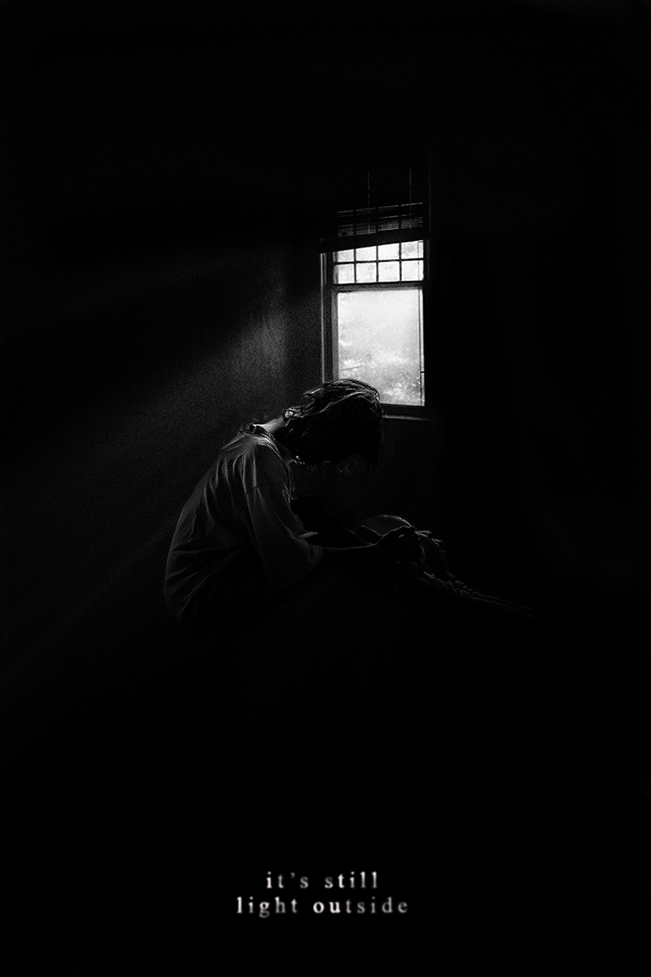
The first one has to be my favorite-- just the lighting and the fact that I'm such a big fan of lighting. But I was scrolling through photos online before I even had an idea of the series, and I came upon this photo of a window in a black room-- and I was like, I have to use this one someday in graphics. So I did, and I put together this idea of someone who's trapped in a dark room, curled up, but never looking up to see the light that shines in from the window that shows the outside. Kinda representing our feelings that it's difficult to see the light/hope/bright side of things even though it's right in front of us?
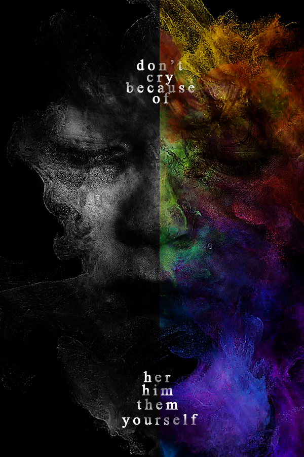
The second one is something I wanted to do because I love contrasting between color and black and white, so I thought, what better way to use this than taking someone and showing two sides of their emotions? So here we are. Like I stated above, I wanted to show a variety of people, so the person I used for this picture is a young boy (can't really tell if you can see that or not, but in the original photo he was). I wanted to show that even children go through so many emotions, instead of always being happy and energetic. The colors sort of represent that? Maybe he's keeping all his emotions on the inside (the color for his inner feelings), and on the outside, he stays grayscale/holding only one emotion. Or maybe he's trying to be all bright and happy on the outside (the colors representing his external image/colors = vibrant happiness) and on the inside, he's facing sadness/struggles represented by the black and white. I kinda wanted to leave it to open interpretation.
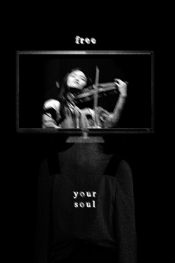
The third one turned out way more different than what I had originally planned, which was a girl standing on a stage, alone, and a spotlight shining down on her, but somehow, it turned out more like a creature walking out of a horror movie RIP. I think I got a little scared making this, because when I was doing the body part, I used a skeleton at first, and it was just way too frighting horror-feel, which I wasn't trying to convey, so I had to exchange it for someone's body. In this one, it's sort of showing that in our heads, we're programmed like computers to believe in what other people believe, which in this case, is this girl, who has to play the violin even though she doesn't want to. People see her as a genius prodigy violinist, but she doesn't want to be one, and instead wants to go after the things that she likes instead of doing what other people want-- except she can't, because she's programmed this way. Her soul is trapped. That's why I wanted to use the sentence 'free your soul' as the caption. I guess it might be misleading into people thinking that she was freeing her soul through music, but in reality, the music was trapping her.
so yeah, that was the story behind each graphic. hope that was inspiring??
Comments