` ( ♡Creamysmiles)
` ♡ ( koko-berry café ¦ closed forever )
review by: hyungsoos
First Impression (Thoughts at first look) [7/10]:
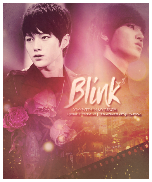
At first glance, the posters quality is extremely impressive. What caught my attention the most was the quality of the pictures. They are both very well chosen.
One thing, that I wasn't too happy about was the colour scheme. In my opinion dark purple, magenta and orange aren't appealing to the eyes, therefore, I deducted points.
[drag to a different tag to enlarge]

Here I have enhanced your colours, by adding vibrance and a green gradient layer set to soft light. this further enhances the image, making it more appealing to the eyes.
Overall, the poster is simple, something that you would normally see when reading a fanfic.
Technique (How well you blended/cut the pictures/any special effects etc) [17/20]:
Actually, I was quite impressed with your blending. The background/textures blended in with the images perfectly. Well Done!
However, I did not like the fact that Myungsoo was very visible to the eye, butSungjong is slightly faded. Since they are the main characters,
they should be equally blended in. So I have deducted points for that. But on the other hand, well done! I really did like your blending.
Resources (Do your images/stocks/brushes/textures enhance the poster) [10/20]:
The textures you have used are very simple. But, I did like how you did not overcrowd the poster with your resources. There are some that you can perhaps change though.
For instance, the camera roll didn't really match the sort of theme you were going for. It is a bit random... Basically, its just there. It doesn't enhance the poster.
Since its quite a simple poster, perhaps, you could add maybe a scratched or grundged texture? Like this
[drag to a different tab to enlarge]

I have just added a simple patterned texture, set it to soft light with an opacity of 10%, afterwards, I just sharpened it, as the grundge textures can sometimes reduce
the quality of the poster. (Just a little tip.)
Myungsoo is a detective, and Sungjong was a high school victim. It didn't really have relation to the story. In my opinion, The poster should have a mixture of angsty and action combined due to the storyline. The roses did not at all suit the storyline and should be replaced with something less delicate.
Composition (Did you make an eye-catching and balanced poster. How well your poster "flows") [10/20]:
Honestly, I find the poster very ordinary. Its a basic and not very eye catching. However, the flow of the poster is very good though. So well done!
Quality (Are your pictures HQ: Do they match the poster) [10/10]:
As I have previously mentioned I love the quality of this poster. Maybe you could sharpen it once to further the quality, but thats optional. I just like my posters that way.
Typography (Does your text enhance the poster) [6/10]:
Your typography on the poster is very basic. It's not good, but its not bad. It kind of just sits there. I would try a font more simpler such as: Georgia, or even Arial (lowercase)
The quotes and watermark are also basic. But, not to worry, everyone has trouble with fonts, I know I did. You just have to think out of the box.
Theme/Mood (Does it match the genre of your story) [5/10]
I guess the pictures were okay, they did match the genre of the story. However, as stated above, your resources do not. The tags of the story states 'Angst. Crime. Detective.' You did not express that in your poster. The poster looks as if it is for a storyline involving the main character carrying a illness. Which is not the case.
Total: 65/100
thank you!
Comments