Graphic Review: st-arships
→Second Invasion Graphics Shop [Closed]
Graphic Review by -byungiehunnie
Colour: 3/5
-
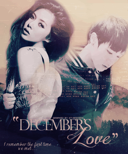
Everything fits with the colour scheme of evergreen and a purple beige. There wasn't any random spots of a very different colour –which is fantastic. I also think the two colours you used go along with each other very nicely. Good job!
- When I saw the title, "December's Love", I expected the colour scheme to be more in the cold tone. A nice icy blues would have been beautiful with this poster. The blue would have fit in more with the title since the story is taken place in winter.
Blending/Cutting: 7/10
-
Hyuna's jacket could have been blended a bit more with the male's varsity sleeve. I actually think you tried to blend him into her. I wish you kept his sleeve more opaque. Her jacket pops right out now –even though she's layered behind the guy (sorry, I can't recognize who he is). It's actually quite distracting when I look at the center or try to focus on either one of them.
- Near the end of the male's sleeve and above the title needs a bit more blending as well. It really stands out because of the contrast between the white sleeve to Hyuna's blue jean jacket. Continuing with the blending on the boy, on his right side there's a sort of a bump. Do you see it? It's the piece of fabric beside his chest. The chunk throws off his right side since he's missing a shoulder. You shouldn't have erased too much of his shoulder. If it was like that originally though, I recommend you try to erase a bit of that chunk and blend into the background a bit more. His collar is actually a bit too translucent along with his sleeve and his left shoulder. I wish you didn't blend it too much.
Theme: -/5
-
We forgot to add the section where you mentioned which genre your graphic falls into, so we won't be counting this section today. We're sorry! (You also didn't reply to my message either and I really wanted to post this review because of the delay so...Sorry!)
-
Let's say you would label this poster underneath light angst/romance. That would be perfect!
- How it matches the title though...The title begs for snow and cold tones, but you didn't give it that! The background also gives me a feel of camping or late summer/ early autumn because of the coniferous trees and mountains. The colour scheme also helps emphasize that feeling you don't want.
Texture: 7/10
-
I really like that rugged kind of scratched out film texture you used. It really made the poster.
-
The bokeh you used near the bottom of the poster worked in really nicely as well. It really brings more attention to the title.
- I'm a bit torn with the letters/coding sprawled across the male's chest. It gives more of a cyborg feel because of the size, font and how the words and letters a pretty close together. I feel without it though, the poster would be a little plain. That's why I recommend you type out a part of the story and set the opacity to low. That way it ties in with the poster and it'll look more attractive because you can choose the font and colour. You could also use a grainy texture or experiment with other type of textures. The letter's on his chest are back words by the way, making it completely gibberish in people's eyes. I managed to make out, "You never know how...".
Font: 5/5
-
The font's absolutely perfect! It's spot on! The font you used for "love" is simply gorgeous. I like how you didn't decide to keep it all one font. The simplicity of "December" and the more fancy side of "Love" work together ever so nicely. The font you used for your quote fits in as well.
- I'm just not so crazy about how it's a quote .gif. I wish you kept it any one of those quotes. When I think of angst posters, .gif doesn't pop up. It seems weird to have a .gif angst poster in my opinion. There might be some cases that prove me wrong, but most of the time it seems off.
Character & Placement Choice: 7/10
-
Whatever happened to the guy's head is kind of disturbing...He looks like a drawing while his clothing are like a living person's. I noticed it seems like he has no nose either. His head really took away the possible beauty from the poster, unfortunately. When you compare him to Hyuna, it weird. You can see the shadows on her face and the dimension. Then you look at him, poof nothing. There's no dimension to him, no depth and no shadows. Just 2D like a simple animated cartoon.
-
Since it is in a winter kind of theme, I wished Hyuna was wearing long sleeves or a jacket over her arms. I know how it's impossible to find a picture that is exactly perfect and we can't all find what we always want since they don't exactly, specifically model for fan's graphics on AFF. I do recall seeing photos where she does wear a more cold weather appropriate clothes though.
- The character placement is a-okay, buddy-o
Overall Apperance: 4/5
- It's a fantastic poster overall. I had to take a point off for the male unfortunately. He's just too...You know how I feel about him. Well, when I first saw this poster, I was like, "Wow! Is she new or did she have a few months of practicing?". It's really good! I hope you can improve and prevent these mistakes in the future.
33 /50...
(minus five for the excluded section)
= 28/ 45 (62%)
date: august 28
Comments