[1] RED RIOT
Punks In Pink: Death Match | A Graphic Contest
prompt number: #03 hallyu wave
total kiss marks: 8
total kiss marks: 8
sent by: red riot
receiver: audience & themob
receiver: audience & themob
sent by: rose
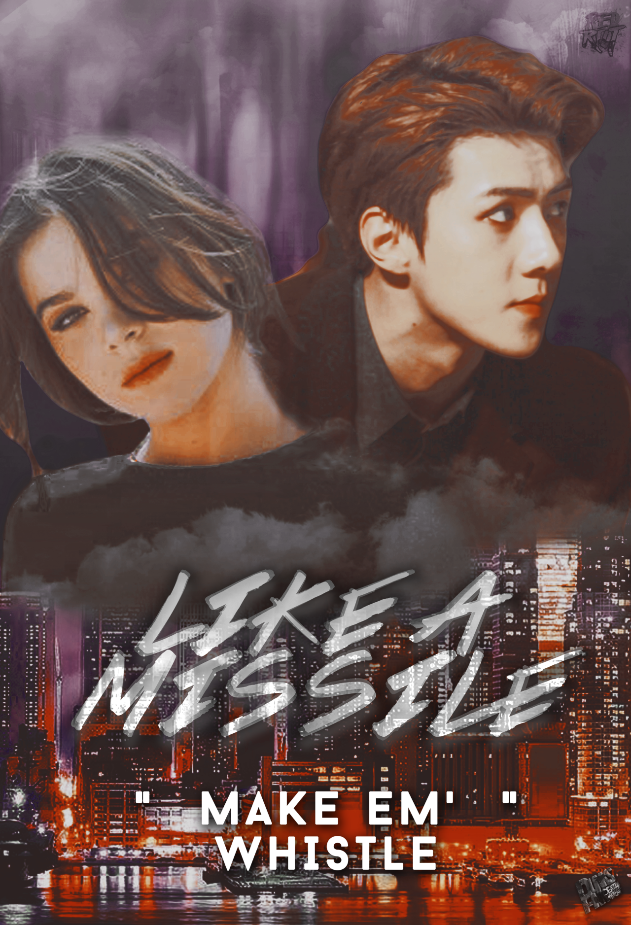
for overall look it's good. the characters chosen & textures are nice. somehow I don't like the png using of these 2 characters. it didn't blend well. make the poster looks a bit off. typography is great. just work on more with your blending, and you're more than good! <3
for overall look it's good. the characters chosen & textures are nice. somehow I don't like the png using of these 2 characters. it didn't blend well. make the poster looks a bit off. typography is great. just work on more with your blending, and you're more than good! <3
sent by: lisa
The characters seem choppy and they don't quite match each other appearance wise. the entire poster has this oily look to it but i'm not really sure if it helps the overall design or hurt it. the typography is not my favorite and the one you used for the quote is quite an eyesore. the cityscape in the background is something that i do like, the use of colors work in favor for you.
The characters seem choppy and they don't quite match each other appearance wise. the entire poster has this oily look to it but i'm not really sure if it helps the overall design or hurt it. the typography is not my favorite and the one you used for the quote is quite an eyesore. the cityscape in the background is something that i do like, the use of colors work in favor for you.
sent by: jisoo
hi, the girl you used was pretty <3 anyway, this graphic was good. the colors and stocks you used were eye-catching (i assumed that you used a psd or perhaps made your own?), and the smoke effect was a great touch as it provided aesthetics and contributed to the overall appeal (oh and great choice of font! the effects were great too /thumbs up/). regardless of this, however, maybe you should work on blending next time. using lasso (i think you used polygonal and then mask for your characters? i'll stand corrected if my assumptions were wrong though) clearly differentiated the characters' photos from the background. even when you may have intended it to be action themed, it should still blend. the placing of sehun and the girl's photo was a bit odd too, especially because it left a blank spot on the middle (in between their heads). lol yeah anyway, great job! overall, the beauty of the graphic stood out more than it's flaws (well no one is perfect. we all do something wrong every time so yep).
hi, the girl you used was pretty <3 anyway, this graphic was good. the colors and stocks you used were eye-catching (i assumed that you used a psd or perhaps made your own?), and the smoke effect was a great touch as it provided aesthetics and contributed to the overall appeal (oh and great choice of font! the effects were great too /thumbs up/). regardless of this, however, maybe you should work on blending next time. using lasso (i think you used polygonal and then mask for your characters? i'll stand corrected if my assumptions were wrong though) clearly differentiated the characters' photos from the background. even when you may have intended it to be action themed, it should still blend. the placing of sehun and the girl's photo was a bit odd too, especially because it left a blank spot on the middle (in between their heads). lol yeah anyway, great job! overall, the beauty of the graphic stood out more than it's flaws (well no one is perfect. we all do something wrong every time so yep).
sent by: jennie
I like the colors. the placement. the stocks. the images used. together, it works well and looks good. although, the cutting or blending, if you may, of the characters' images looks odd especially their hair (the girl's hair). also, i do not know which is the title and which is the quote. the quote is the one with the quotation marks, i assume. lol. but it's more noticeable than "like a missle" and it takes the focus from the title. remember, the characters and the title, the focus must be on them. meaning, when you first glance at a poster, the first thing one must notice is those two. :DD overall, great job~ and good luck!
I like the colors. the placement. the stocks. the images used. together, it works well and looks good. although, the cutting or blending, if you may, of the characters' images looks odd especially their hair (the girl's hair). also, i do not know which is the title and which is the quote. the quote is the one with the quotation marks, i assume. lol. but it's more noticeable than "like a missle" and it takes the focus from the title. remember, the characters and the title, the focus must be on them. meaning, when you first glance at a poster, the first thing one must notice is those two. :DD overall, great job~ and good luck!
Like this story? Give it an
Upvote!
Thank you!
Comments