OMG they're so beautiful *-* and really represent the theme of the stories !! You're full of talent :) .and can we stop and look for a moment that pic of kris ♥-♥ I can't....
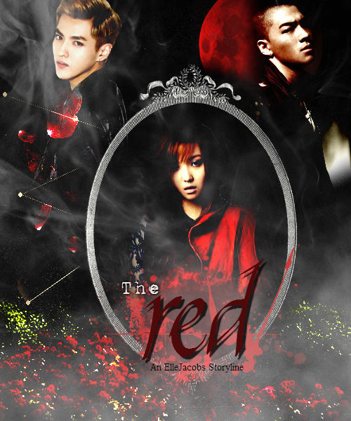
The poster for "the Red" reminds me of how much I want the other chapter T^T... The first chapter was so intense and I love it. I'm gonna reread the first chapter now lol
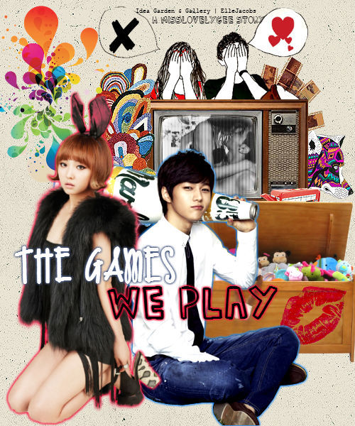
I haven't read "The Games We Play" but the poster shows that they story is fun to read, as the name implies. I really like both of the posters :) One is dark while the other is fun and colorful
I'm sorry that I cant give you good critique because I don't know much about graphic designing. But whenever I need a poster to be done, I'll go to you first ;)
I totally love both of these posters. I already fangirled at "The Games We Play" poster in MLG's blog XD and I love "The Red" new poster. I get the wolf vibe from TY's picture! XD <3 That's one of my favorite fics right now. XD
Comments