Coffee Bowl, long dashes. Really? No. Just stop LOL.
What a cute creator. I'm talking about the username -> strawberryjamskookie haha xD
Aww, you ship Jungkook & Jimin. How cute~
I saw your profile. You like Shawn Mendes. Me too. I never paid attention to him until Treat You Better came out. And I got interested in his music. Mercy was really good. Also, I heard Stitches because of Sam Tsui's cover. I didn't like Stitches until I heard Sam Tsui's cover. I am a fan of Sam Tsui's covers lol. I am horrible. Anyways, Shawn is a cute and talented kid. I like your profile and cute layout haha!
Okay. So the concept is supposed to be fluff. *nods my head*
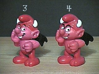
The colors of this graphic...I like it. It kind of reminds me of cotton candy instead of kookie's & cream. But it is a cute color. So it suits the fluff theme in a way. The only problem is that you said it was supposed to be fluff, correct? But Jimin & Jungkook's picture doesn't really scream fluff to me. When you think of fluff, I think of something amusing with some kind of cliche like those lovey dovey kisses and hugs and smiles and what not. Does that make any sense? I sux at explaining. It has been a while since I've been on AFF LOL. Like V said in the past: "Why so serious?" Their facial expression look so serious under these bright colors. I can see you tried to make it work. But it's the serious facial expression that bothers me. At least make their faces look happy. It's a fluff. I'm just saying >////>
Your Buck-Tick stuff on your profile always make me smile.
Acchan, when he was young, was the most beautiful Japanese man I had ever seen. That's my opinion LOL. xD
He is still handsome and cool.
Finally! A graphic request!
I'm here, Rose! //waves fin
Let's see... upon first inspection, I'm not getting the fluff vibe. Like Rose mentioned, the pictures don't match the genre you're targeting. Fluff is like those smiling and don't-take-me-seriously faces. The font choice looks good for fluff but for this one, maybe have them align at the center and not too much near the edges. If you want them near the edges, make them bold and go off the canvas a little more and have the pictures of Kookie and Chim Chim in front of it like how magazine covers look. The layering and slanting of the text is good for fluff. Perhaps adding a background (like those rectangles with the shadow behind them) behind it would make it stand out more. The cookies look out of place or maybe they're just too big. I honestly thought at first that the cookies didn't match at all, like those were mutated cookies or something. The coloring threw me off, haha. Little cookies as a background pattern might work better. You can even alternate the colors like what you did and work your way around that. Or instead of that swirly texture on that solid background, have a simple pattern like slanted stripes and add the little cookies on top. Then as the finishing touch, have the dripping chocolate image as the top (and probably the bottom, too) border.
Good luck on the contest, Jams! I kind of ended up adding some suggestions on top of the critique. You don't have to listen to them though because those are just my take on how I'd make a graphic with those criteria.
So I'm not the only one who wasn't feeling the pictures. Like don't get me wrong, Jimin and Jungkook look great in those photos. But not in a fluff theme is all. Spoken like a true poster master hehe~
I just go based on first impressions of the poster lol.
The cookies and stuff remind me of horror. Like change the color red, it would remind you of blood smearing down, wouldn't it, Ann?
Same. I also go by first impression before I nitpick things. I even nitpick my own graphics but hope no one sees them because re-dos are a pain sometimes. They're not too visible though (I hope), haha. Ah, I forgot to mention, why is Jungkook so pink? At least Jimin looks normal.
They look like Frankenstein cookies. Omg, bloody cookies... that's horrible.
I can't nitpick as good as you because I am not an expert in poster making. I just go by the feeling of the genre and theme and photos. And if it appeals to me. I believe you when you said re-dos are a pain because you want to believe your hard work is perfect. But then, you realize you have to make adjustments and can feel lazy to do so lol.
Jamskookie probably made it so pink to emphasized the fluff theme. I guess. *shrugs my shoulders* True. I like Jimin.
@Rose
I was referring to you as the poster master, aha. I'm not an expert either; I'm just an art enthusiast. Ah, it depends on the outcome. If I can bypass its little imperfection then I just leave it as it is (which is mostly the case).
Hmm, if that is so, I'd rather just have him be monochromatic. Then the pinkish flesh wouldn't be as obvious as some sort of weird skin tone like that 'what the heck is that thing' pink smurf. Omg, Rose. If you say it like that then no. That sounds gross. .__.
Me? A poster master? Girl, you crazy. I am no poster master. Trust me. Did you not realized how much better you are at critiquing than I am? Because you totally are. I am dead serious. Makes sense *nods my head*
LOL. I've been trying to help out beginner designers on here with their work as well so the least that I can do is give somewhat detailed suggestions on top of critiques. The first time I tried to help one user, she didn't know what I was talking about, lol.
I now think of red velvet cookies differently... thanks.
Chapter 10: Thank you for the critique, though this review was confusing as heck because of the layout I still was able to grasp the reviewers' insightful notes. Clinged should have been clung (obviously). I use google doc so it should automatically have a spell checker but it only checks to a certain degree, as you can see most of the time it doesn't catch . I don't plan to change "In the decades of 1800..." - maybe I'll write it as "In the 1800s" but - personally, I feel - yeah it's what you may find in a textbook; however, referring to a dynasty makes me feel I should now write accordingly to a specific non-fictional time period. And that's something I don't want to do.
I'm a very, in fact overly, descriptive writer and it's something I just naturally do. If I cut it down then I get this feeling that my readers wouldn't get the full picture I wanted to paint for them. But I will practice being even less descriptive (no lie, if you saw/read "Concealed Identity" some month ago you would want to strangle me). Thank goodness you for bringing up the formal and informal thing. I went back and forth with it so much I still don't know whether to keep it formal or informal. But when I get it figured out I'll go back make those changes. Overall I took a lot away from this 'discussion', even if it doesn't look like it. Thank you for being so quick with the review.
Ann - be prepared for some dense stuff in "Camellia On Top". I'll keep you in mind and try to make it less dense than "Concealed Identity" but no promises >_< due to the same reasons above.
Chapter 8: if anything i am grateful for ur honesty lmao there's no exactly romance in the story; it mainly focuses on the main character trying to find the truth of her sister
She's actually based on UMJI from g-friend and mate, i also happen to not like the name eunji but i thought whatever otl
Thanks for your honest comments and I'll be sure to check the tenses when I have the time
Chapter 6: Dafaq. Hahahaha. There are Jose Rizal's minions here omg. Lol, I tried looking for reactions regarding the end part of the story but okay I had fun reading this. The story's trigger warned hence the 'subs only' so I really have no choice regarding that :)
The excerpt reading was quite nice, lol. I tried my best. XD thanks for this though.


Katerina93 Rose