[G.R.] petrabigail
§orarius★§hop || Graphic Request & Poster Review Shop || BATCH 2 || CLOSED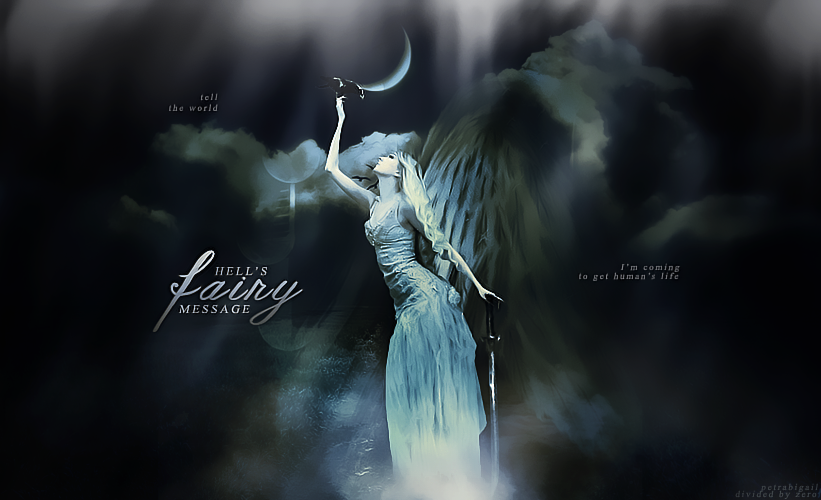
pickup shop home staff information form & application rubric layout credit
TITLE: Hell's Fairy Message
MOOD:Dark, Fantasy
REVIEWER: DanielArmandLee
REVIEWED FOR: petrabigail
MOOD AND THEMES (8.5/10)
While writing this review, I am not connected to the internet and therefore I couldn't check what mood or theme you put so I'm going to make a guess and say that this is in the fantasy genre. Because yeah HELL+FAIRY… if this isn't fantasy then I don't know what the poster is up to. On the first look, it has this gloomy ethereal (why do I keep using this word?)glow going on and if I would put a background music I'd probably pick Evanescence's My Immortal for it. The almost monochromatic colors with a lot of cloud and light leak use produces an overall effect that says "Hey, I'm mysterious and enchanting." very dark fairy tale like. Overall it is pretty consistent with the fantasy fairytale vibe but my main problem is the idea of "Hell's Fairy". When you say the word hell, you think of a place that is hot and full of anguish and torment. That conflicts with the rather serene but foreboding aura that your piece gives. If you say the word hell, I would expect harsh hot color leaks like red or scarlet accents. But all I get are cool colors and very subdued warm undertones (which the regular person wouldn’t even notice). I think it would be more appropriate to call it "Underworld" instead of "Hell"? Because honestly if I will have to picture a fairy from hell, I wouldn’t think of the ghost of a blonde Rowena Ravenclaw. I'd picture a star grade chick with massive , leather clothing and bat wings. So there, all in all. The fantasy fairytale thing is nice but the hell concept is just a few degrees off.
COLOR HARMONY (9.5/10)
I like that you didn’t use too much color on this piece. In fantasy posters, except of course in fantastic magical adventures like Magical Imaginarium of Doctor Parnassus kind of concepts, less is more when it comes to colors. We focus on its dreamlike qualities which is accentuated by blurry, glowing colors that bleed into each other. In your case, since it is a darker concept, the almost monochromatic scheme of things achieves this. I like that the moon and the woman are of the same color which makes it seem that they are made of the same thing. I don't have any problem with the color harmony except that it's too safe. This is a mistake I often commit: making everything too monochromatic even when it is not when we can add something that's a bit more interesting like strengthening the warm undertones since everything else is cold. But again, it is safe. So yeah, almost full points for this. It's not really a mistake anyway. More like we could have gone for amazing. But beautiful is good too. I actually like it.
STOCK USES (20/25)
I give nine points to the woman stock image you used. I love the form of her pose. It is dramatic and dynamic. I can't see much of her face since she is looking at the crow but I guess that is a plus since it adds to the mysterious factor. What I don't like about the woman is that she is just a touch too sharpened especially the edge of the hand leading to the crow. It would be nice if you just blurred it a bit because it distracts from the soft fantasy feel of the poster. If you would compare both her arms, you would see that her left arm with the hand touching (but not holding) the sword has a soft graceful flow. It blends easily into the rest of the poster whereas the right hand is like a knife that jaggedly cuts through it. If you do not want to blur it, maybe you could use the burn tool very lightly at the edges of her arm so that it softly graduates from her alabastrine skin to the dark night sky. I am not sure if the crow is part of the same source image as the woman but I'm pretty sure the sword isn't because she isn't holding it, which is kinda odd. So I give the other renders a four because the sword is just standing there awkwardly like "Okay, go on. Romance your crow. I'm just gonna stand here and pretend gravity isn't a thing. It's not like I'm heavy or anything." I have a feeling though that you got this in a precut/render pack or something and they were already sewn together so it might not be your fault at all but I still find it awkward. For the textures and other stock images , I'll give you a seven. I generally feel that the textures were well blended and masked so there are no visible seems. However the piece overall feels a little too bare. I feel that you could have added a little more. Not too much but just a little more just so that it could balance all the white space at the sides. Another thing that concerns me is the wings of the woman. I have said earlier that I'm not really convinced with the white winged hell fairy so I'll let that pass and just think that she is a fallen angel. However I am not sure of what you want to
Comments