12.13.2015 | lightmachine | Pride
A+, B- Reviews. [CLOSED]"username: lightmachine
link: http://i.minus.com/jNBNBRNA3AImb.jpg
title: Pride
notes: I've been dabbling on blending posters a little bit, so can you comment on my blending? typography is also my weak point, so i'd be happy if you can comment on that, too."

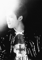
Thank you for patiently waiting for your review, I know it's well overdue, lol. And thank you for requesting! :D Witout further a-do, let's get to it! Of course, I'll first address what you said in your application/ request- AND as I will forever say, everyone has their own personal tastes so just because I may say it's bad doesn't necessarily mean its bad, it means that it didn't suit my personal preferences. In conclusion, never take anything negative to heart; use it to grow and improve.
Blending| These types of artwork are usually ones that I don't care for too much because there is usually so much to look at and take in that I loose interest, lol. But then again, these are usually the ones that also take the most time because of the precision, attention and patience that these pieces demand. Overall, I don't see anything wrong with your blending, I know that with these types of pieces (when I've attempted to do them, lol) blending is very crucial. I feel like the left side is a tad messy.... but that's not the word I'm actually looking for... it's... the layers kind of overlap in a way that seems flawed (after looking at it for about an hour and a half now). Again, the words I'm using are harsh-- I know, dull them down x5 lol. For example, your tree/ forest stock to the immediate left of the girl is okay, but move up it blends into the house and what looks to be a chair. Personally, I'd delete that. It kind of looks like an unnecessary part of the work and it'd still be okay (the piece) without that. The other tree (all the way to the left) blends into the house and then part of it blends into the chair-- The part that blends into the chair (again, personally) I'd erase that, it looks kind of awkward and as if it came from no where. All-in-all, there are only very minor problems with your blending. Minor things. I don't know if you do this, but my recommendation for working with this or other pieces in general is to do it, save a PDF file of it and come back 2-4 days later and look at your piece with a pair of fresh eyes-- if you already do do this, GREAT! If not, I personally find it very helpful because that's when I usually catch my mistakes and what-nots.
Typography| My absolute favorite. I love fonts so much because they're so unique and fun and enchanting. Overall, your credit mark is nice-- simple, hidden. Your title which is the main focus."Seven deadly sins"-- looks fine, a simple text. Overall, your font choices are nice they're simple and they fit the overall theme and mood of your piece. The color I would personally use a darker red-brown color. The gradient effect on the font looks nice and the blur behind it looks fine. The only thing for me is that the "P" in "Pride" throws me off, I think you're trying to accent it, but the font you chose makes it look like a "D" instead of a "P." I think, what I would've just done is use the same font as "Pride" but just make the "P" a bigger size and if you wanted to, to itaclized (lmao, forgive my butchering of the spelling, I don't have spell-check on) or to even bold it. Otherwise, the typography looks fine to me.
Now for my personal overall comments:
- I think that the general placement of your title is too close to the character, I mean, you have so much space all around her you know, so I'd move it more towards the left-- where there are more of that "negative"/"black" space.
- The tiara is very-bling-bling, and it's seems to have more "light" than the rest of the piece-- I don't know if that's intentional or not, but if not, I'd fix the lighting and it also seems more yellow than the rest of the bg.
- Maybe it's just my laptop, but I think her eyes are blue (?) and I like that there's that little pop of color in there. I don't know, I really really like it------ and if it's not blue------ I like the "illusion" lolol.
- It's busy yet attractive and still somewhat simple. I overalll, dig it. lol.
That basically wraps up my "review" on your piece. I'd like to thank you again for your patience! <33333
I hope this helped you in some ways. As always if you have any questions, don't be shy to contact me in some way-- commenting, PMimg me, posting on my wall, whatever it is. :D
Comments