11.30.15 | amaeteur | when spring meets winter
A+, B- Reviews. [CLOSED]"username: amaeteur
link: http://40.media.tumblr.com/07ad47d96acc3d8823f3c9552cd45359/tumblr_nwtw7mYj521txcwhto1_500.png
title: when spring meets summer
anything else: im very bad at font, color & placing so do let me know on how you think i did on this ^^ thank you in advance! looking forward to the review~"

Firstly, thank you for requesting and waiting ever so patiently for your review, I again apologize for being so late! >.< Anyway, lets get to it shall we? I'll first address what you said in your application/ request- as I will forever say, everyone has their own personal tastes so just because I may say it's bad doesn't necessarily mean its bad, it means that it didn't suit my personal preferences. In conclusion, never take anything negative to heart; use it to grow and improve.
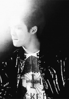
- font: Fonts are personally my favorite aspect of someone's artwork, I absolutely adore fonts, every single one. And in your piece, I don't see anything bad about it. I like how you emphasized "spring" and "Winter," those are both excellent and appropriate emphasis. The script font you chose, however, strikes me as a font that's more suitable towards those pieces that are more straight up romance and almost borderline romcom... Your font (I'm implying) seems more angst romance (I don't know if angst is the word I'm looking for, lol, but something along that line). But honestly, I think that the fonts are perfectly fine for this piece, it's appropriate and works.
Now, The size of "spring" seems like it's a tad too small, whereas "winter" is a nice size. Bet let's say- if you made "spring" and bigger, it'd create an awkward gap and what-not, so then in that case, I'd make "winter" the same size as "spring." And I'd move the font itself up and to the left because it seems to be too close to Sehun's head, drawing too much .... gravity (?) towards him. And if I (or you...) moved the whole title up and left, I'd make the whole thing maybe 1-3x (font size) bigger (if that makes sense). I personally love the blur behind the font (I always used that technique, lol, so it's a personal favorite that I'll always love)! The coloring is nice, you chose something from the poster itself, so very readable, very approriate, very nice.
You didn't ask, but since it's part of "font" (to me) I just wanted to say, I appreciate that your credit is small and not OUT THERE. Some people will really make their credit mark stand out (and good for them if they like it like that but personally...), I find it unneccessairly because the main point of the poster is to promote the characters, the mood of the story and the story itself, and not specifically supposed to promote the designer, you know? Now, don't get me wrong, you should ALWAYS out your credit marks there, but you should also be considerate to the author(s) and their story, don't take the attention away from the bigger picture... All-on-all, I had to search for your credit mark which is nice because that means the main focus is everywhere else but there. - coloring: love it. It's Black and White, but I see hints of blue and accents of that red/orange/yellow, but it's subtle enough to make small yet enhancing accents. It's important to have accents because that enhances the piece and gives some colors for viewers to see. From the bottom up, it almost seems to act as a gradient, or at least, that's what I see. I really love your coloring for this piece. The only (so very minor and really not even enough to fuss about lol) thing I see that is kind of ... awkward it that the right side in general seem to have more depth because there are darker colors contouring it, whereas the left side (especially the sky) seems to have less depth, less contour. But honestly, it's not even a big deal, it's so VERY minor, tbh lol. I personally love the coloring and all that stuff!!!!!
- placement: I don't have a big problem, both characters are in the center, at the bottom. The only minor thing is that, personally, I feel that Sehun is too far up (compared to the girl), I'd bring him down just a tad more. I personally place one of my characters higher than the other, so again, this is another personal favorite technique, so I dont have much to say, lol. I like the extra stocks you added in the background, it gives more texture and elements to the poster so it's not so boring, and you also didn't overload it. I also like the snow, it's very appropriate. You also chose good character pictures. They match the theme.
- Now for my personal comments. I think that overall, you did an EXCELLENT job! When I first opened up your poster, I was pleasantly surprised. However, looking at it for about an hour and a half now, lol, I think it's a little dull. So what'd I do is sharpen the whole poster. I don't remember exactly how to do it on photoshop (if that's what you're using, I don't know what you're using) but there are tutorials everywhere. The ulzzang/ female character seems to be more contrasted than Sehun, so I'd go in and brighten him up to match the girl. Sehun's neck/ back seems to be blended too much into the background where it's kind of like "ope, where's Sehun?" lol, creating an awkward white gap there.
- Overall, I honestly and seriously love this artwork. I'm not someone who can go around telling you what to do and what not to do because everyone has their own taste and their own unique style, you know, so if I've written anything that's hurt your feelings, I apologize. I hope you enjoyed your review, I hope I've inspired or taught you something new. Continue to improve and create amazing posters, I do hope you come again! :D
Comments