Tiffany "Casio's Baby G"

`* Cherry Smash; A Graphics Gallery
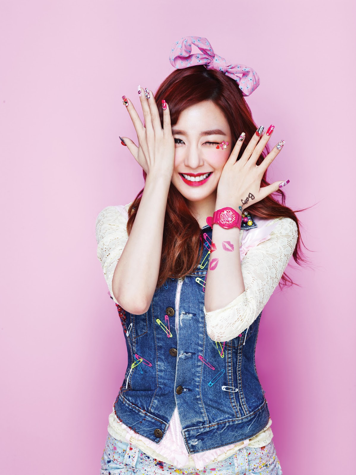
`*Tiffany

I was bored and I was searching for SNSD pictures. As I came across Tiffany's picture for the Baby-G photoshoot, I wanted to edit it a bit :) The PSD I used gave a bit of an extra and nice coloring to the original picture. I added a bit of elements and played around with color and this becomes the results XD I really like this since it gives out a playful tone :3

Quotes: ---

Mood/Theme: Playful/ Happy

Character(s): Tiffany {SNSD}

*Credits to the original owners of the pictures and textures.


Like this story? Give it an Upvote!
Thank you!

Comments

You must be logged in to comment
aleric
#1
Chapter 7: very nice! i especially liked your heaven poster ;^;
i hope to see more in here! ^^
mblaqfirstlover
#2
Chapter 7: nice i like it, by the way, can you pm me?
--iSoul
#3
Chapter 6: OMG. I'm so sorry for spamming the comment box XDDD Good start so far! keep practicing and I'm sure you'll make reaallly good posters in the future ^^
--iSoul
#4
Chapter 6: Wooaaah. Good job with the blending and textures on this poster! I really like it! O u O buutt.. the only criticism I have..I think you know what I'm going to say.. Fonts. Yup. Sorry, Very picky here XD The title seems fine now that I look at it more closely but the credit.. Maybe just try a Times New Roman at size 10 italic and space the characters. ^^
--iSoul
#5
Chapter 5: Good job with this one. The blending might need a bit more work. Have you ever considered adding some textures or coloring the poster a bit? It helps, trust me. Helps soooo much XD Once again, I know I'm being picky but fonts. fonts. fonts. It's too small and the color doesn't really match the poster. Sorry if I sound harsh but gahh. As I said, I'm just really picky with typography XDDD
--iSoul
#6
Chapter 4: waah very cute poster. Bleh. I lack orginality in cute posters. I like everything except for the font. Sorry. I'm just a very picky designer when it comes to fonts. I suggest you have some kind of white background to the font to make it stand out a bit more. For the credits at the bottom, I suggest you have it in a less complicated font. ^^
--iSoul
#7
Chapter 3: Woaaah style. I really like your style in the poster. The technique you used is really cool and I really like the coloring. I'm only confused with the font though. What's supposed to be the title? Next time, I suggest you make the title really stand out (another font) or just have the quotes and everything else a bit smaller. other than that, good job O u O
--iSoul
#8
Chapter 2: I really like the style of this poster. I do suggest you try coloring the poster though since the colors really stand out from the background. Also, try working a bit on your font ^^
k-popsweetie
#9
Chapter 5: Your posters are AMAZING!!!!!!!!!!!
topsecret99 #10
Chapter 5: The posters are.... SUPERB