Chapter 9: hallo~ ^^
I saw your works~ and yes you are getting better~ ^^
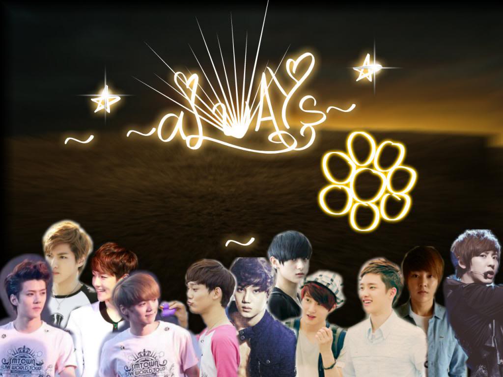
I just wanna suggest something I'm sorry If I'm gonna sound mean :)
remember that when you make a poster the font should blend well with the poster :) the font you use on this poster is kinda girly with the heart and stuff idk if you really like it. but it just ruined the mood of the images on the background~ ^^
hope I helped about fonts~
and for your blending don't lower the opacity too much cause we can't see the characters image well~
hope I helped~ ^^
Chapter 2: hi there.
i saw this and got curious so i opened to see
so, um, can i give suggestions?
in the first poster [chap 1], there's lay n the ulzzang. for lay, u shouldn't use pic like that, where the head gets cut off, but it's your first so it's okay, i guess.
also, a tip, when your canvas is too big, normally, you'd stretch the pics to fic - do not do that. 'coz if u stretch too much, the pic will become too big and will lower it's quality [poster 2, girl]. i suggest using big pictures.
also, another tip: for "cute/happy" posters, i suggest cutting the background off of the image rather than erasing it. for "angst/romance" posters, u can blend the two pictures.
and, can i ask what u use in editing?
also, i'd suggest looking at tutorials too. there's ton of them here on aff so go check some of them out.
[sorry if i sounded mean, i didn't mean to sound mean]
but i hope i helped...??
Comments