Color
Description
Color- the property possessed by an object of producing different sensations on the eye as a result of the way the object reflects or emits light.
....... or is it?
Foreword
society is split up by color in a way. throughout the world you would be placed with the color that fit you at birth. society had levels. first white then red the orange yellow green blue purple black.in the center of the white city is the center of the world a tall white tower that vreache sup into the sky this is where the rulers off all the colors live its where children are born and seperated and sent to there own color.The goverment and everything there. each color has a tower in the center of thier city for the same reason the tower holds the representive the goverment controls water electricity hospitalizing .The white tower is the biggest and the most important. each color specaliazes in a certain
one person from each color staqrts having dreams each having the same dream about the city of black. nothinging has gone or comefrom black in years black had been an outcast city.they watc hed the last border.communcation had stop so the society presumed that they had been whiped.
they dreamed walking through a city with no light buildings shacks bult from scraps. people with blured faces waling around in torn clothingthey walked through the city meeting one another they are all drawn to the tower the tower is falling apart they climb there way up to top where theres an old man being kept alive by machines talking through a machine theres a video that he he warns them about they see a choice t o forget or to hit the button thatll change everything.
they have this dream everynight i explain there life as slowing aspects of themselfs start to change and something starts to draw them to the city.one day white girl just starts running running untill she reaches the white border looking out over the deep trench that spereated the land standing at the beginning of a bridge that connected to red. giverment chases red meets white hides her till they both run and so on till they get to the blac k city they stic k out ;ike a sore thumb hte change the thning boom done stories over
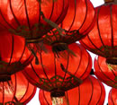
Red
¨ Red is the color of fire and blood, so it is associated with energy, war, danger, strength, power, determination as well as passion, desire, and love.
¨ Red is a very emotionally intense color. It enhances human metabolism, increases respiration rate, and raises blood pressure.
¨ It has very high visibility that’s why stop signs, stoplights, and fire equipment are usually painted red.
¨ In heraldry, red is used to indicate courage. It is the color found in many national flags.
¨ Red brings text and images to the foreground.
¨ Use it as an accent color to stimulate people to make quick decisions; it is a perfect color for 'Buy Now' or 'Click Here' buttons on Internet banners and websites.
¨ Red is widely used to indicate danger (high voltage signs, traffic lights).
¨ This color is also commonly associated with energy, so you can use it when promoting energy drinks, games, cars, items related to sports and high physical activity.
Light red represents joy, passion, sensitivity, and love.
Pink signifies romance, love, and friendship. It denotes feminine qualities and passiveness.
Dark red is associated with vigor, willpower, rage, anger, leadership, courage, longing, malice, and wrath.
Brown suggests stability and denotes masculine qualities.
Reddish-brown is associated with harvest and fall.
Orange
¨ Orange combines the energy of red and the happiness of yellow. It is associated with joy, sunshine, and tropics.
¨ Orange represents enthusiasm, fascination, happiness, creativity, determination, attraction, success, encouragement, and stimulation.
¨ To the human eyes, orange is seen as a very hot color, so it gives the sensation of heat.
¨ Orange increases oxygen supply to the brain, produces an invigorating effect, and stimulates mental activity. It is highly accepted among young people.
¨ As a citrus color, orange is associated with healthy food and stimulates appetite.
¨ Orange is the color of fall and harvest. I
¨ n heraldry, orange is symbolic of strength and endurance.
¨ Orange has very high visibility, so you can use it to catch attention and highlight the most important elements of your design.
¨ Orange is very effective for promoting food products and toys.
Dark orange can mean deceit and distrust.
Red-orange corresponds to desire, passion, pleasure, domination, aggression, and thirst for action.
Gold evokes the feeling of prestige. The meaning of gold is illumination, wisdom, and wealth. Gold often symbolizes high quality.
Yellow
¨ Yellow is the color of sunshine. It's associated with joy, happiness, intellect, and energy.
¨ Yellow produces a warming effect, arouses cheerfulness, stimulates mental activity, and generates muscle energy.
¨ Yellow is often associated with food.
¨ Bright, pure yellow is an attention getter that’s why taxicabs are painted this color.
¨ When overused, yellow may have a disturbing influence; it is known that babies cry more in yellow rooms.
¨ Yellow is seen before other colors when placed against black; this combination is often used to issue a warning.
¨ In heraldry, yellow indicates honor and loyalty. Later the meaning of yellow was connected with cowardice.
¨ Use yellow to evoke pleasant, cheerful feelings.
¨ Yellow is very effective for attracting attention, so use it to highlight the most important elements of your design.
¨ Men usually perceive yellow as a very lighthearted, 'kiddish' color, so it is not recommended to use yellow when selling prestigious, expensive products to men - nobody will buy a yellow business suit or a yellow Mercedes.
¨ Yellow is an unstable and spontaneous color, so avoid using yellow if you want to suggest stability and safety.
¨ Light yellow tends to disappear into white, so it usually needs a dark color to highlight it.
¨ Shades of yellow are visually unappealing because they loose cheerfulness and become dingy.
Dull (dingy) yellow represents caution, decay, sickness, and jealousy.
Light yellow is associated with intellect, freshness, and joy.
Green
¨ Green is the color of nature. It symbolizes growth, harmony, freshness, and fertility.
¨ Green has strong emotional correspondence with safety.
¨ Dark green is also commonly associated with money.
¨ Green has great healing power. It is the most restful color for human eyes; it can improve vision.
¨ Green suggests stability and endurance.
¨ Sometimes green denotes lack of experience; for example, a 'greenhorn' is a novice.
¨ In heraldry, green indicates growth and hope.
¨ Green, as opposed to red, means safety; it is the color of free passage in road traffic.
¨ Use green to indicate safety when advertising drugs and medical products.
¨ Green is directly related to nature, so you can use it to promote 'green' products.
¨ Dull, darker green is commonly associated with money, financial world, banking, and Wall Street.
Dark green is associated with ambition, greed, and jealousy.
Yellow-green can indicate sickness, cowardice, discord, and jealousy.
Aqua is associated with emotional healing and protection.
Olive green is the traditional color of peace.
Blue
¨ Blue is the color of the sky and sea.
¨ It is often associated with depth and stability.
¨ It symbolizes trust, loyalty, wisdom, confidence, intelligence, faith, truth, and heaven.
¨ Blue is considered beneficial to the mind and body. It slows human metabolism and produces a calming effect.
¨ Blue is strongly associated with tranquility and calmness.
¨ In heraldry, blue is used to symbolize piety and sincerity.
¨ You can use blue to promote products and services related to cleanliness (water purification filters, cleaning liquids), air and sky (airlines, airports, air conditioners), water and sea (sea voyages, mineral water).
¨ Blue is linked to consciousness and intellect.
¨ Blue is a masculine color; according to studies, it is highly accepted among males.
¨ Dark blue is associated with depth, expertise, and stability; it is a preferred color for corporate America.
¨ Avoid using blue when promoting food and cooking, because blue suppresses appetite.
¨ When used together with warm colors like yellow or red, blue can create high-impact, vibrant designs; for example, blue-yellow-red is a perfect color scheme for a superhero.
Light blue is associated with health, healing, tranquility, understanding, and softness.
Dark blue represents knowledge, power, integrity, and seriousness.
Purple
¨ Purple combines the stability of blue and the energy of red.
¨ Purple is associated with royalty. It symbolizes power, nobility, luxury, and ambition.
¨ It conveys wealth and extravagance.
¨ Purple is associated with wisdom, dignity, independence, creativity, mystery, and magic.
¨ Almost 75 percent children prefer purple to all the other colors.
¨ Purple is a very rare color in nature; some people consider it to be artificial.
Light purple evokes romantic and nostalgic feelings.
Dark purple evokes gloom and sad feelings. It can cause frustration.
White
¨ White is associated with light, goodness, innocence, and purity.
¨ It is considered to be the color of perfection.
¨ White means safety, purity, and cleanliness. As opposed to black, white usually has a positive connotation.
¨ White can represent a successful beginning.
¨ In heraldry, white depicts faith and purity.
¨ In advertising, white is associated with coolness and cleanliness because it's the color of snow.
¨ You can use white to suggest simplicity in high-tech products.
¨ White is an appropriate color for charitable organizations
¨ Angels are usually imagined wearing white clothes.
¨ White is associated with hospitals, doctors, and sterility, so you can use white to suggest safety when promoting medical products.
¨ White is often associated with low weight, low-fat food, and dairy products.
Black
¨ Black is associated with power, elegance, formality, death, evil, and mystery.
¨ Black is a mysterious color associated with fear and the unknown (black holes).
¨ It usually has a negative connotation (blacklist, black humor, 'black death').
¨ Black denotes strength and authority; it is considered to be a very formal, elegant, and prestigious color (black tie, black Mercedes).
¨ In heraldry, black is the symbol of grief.
¨ Black gives the feeling of perspective and depth, but the black background diminishes readability.
¨ A black suit or dress can make you look thinner.
¨ When designing for a gallery of painting or photography, you can use a black or gray background to make other colors stand out.
¨ Black contrasts well with bright colors. Combined with red or orange - other very powerful colors - black gives a very aggressive color scheme.
|
RED. Physical Being the longest wavelength, red is a powerful colour. Although not technically the most visible, it has the property of appearing to be nearer than it is and therefore it grabs our attention first. Hence its effectiveness in traffic lights the world over. Its effect is physical; it stimulates us and raises the pulse rate, giving the impression that time is passing faster than it is. It relates to the masculine principle and can activate the "fight or flight" instinct. Red is strong, and very basic. Pure red is the simplest colour, with no subtlety. It is stimulating and lively, very friendly. At the same time, it can be perceived as demanding and aggressive. |
 |
|
BLUE. Intellectual. Blue is the colour of the mind and is essentially soothing; it affects us mentally, rather than the physical reaction we have to red. Strong blues will stimulate clear thought and lighter, soft blues will calm the mind and aid concentration. Consequently it is serene and mentally calming. It is the colour of clear communication. Blue objects do not appear to be as close to us as red ones. Time and again in research, blue is the world's favourite colour. However, it can be perceived as cold, unemotional and unfriendly. |
 |
|
YELLOW. Emotional The yellow wavelength is relatively long and essentially stimulating. In this case the stimulus is emotional, therefore yellow is the strongest colour, psychologically. The right yellow will lift our spirits and our self-esteem; it is the colour of confidence and optimism. Too much of it, or the wrong tone in relation to the other tones in a colour scheme, can cause self-esteem to plummet, giving rise to fear and anxiety. Our "yellow streak" can surface. |
 |
|
GREEN. Balance Green strikes the eye in such a way as to require no adjustment whatever and is, therefore, restful. Being in the centre of the spectrum, it is the colour of balance - a more important concept than many people realise. When the world about us contains plenty of green, this indicates the presence of water, and little danger of famine, so we are reassured by green, on a primitive level. Negatively, it can indicate stagnation and, incorrectly used, will be perceived as being too bland. |
 |
|
VIOLET. Spiritual The shortest wavelength is violet, often described as purple. It takes awareness to a higher level of thought, even into the realms of spiritual values. It is highly introvertive and encourages deep contemplation, or meditation. It has associations with royalty and usually communicates the finest possible quality. Being the last visible wavelength before the ultra-violet ray, it has associations with time and space and the cosmos. Excessive use of purple can bring about too much introspection and the wrong tone of it communicates something cheap and nasty, faster than any other colour. |
 |
|
ORANGE. Since it is a combination of red and yellow, orange is stimulating and reaction to it is a combination of the physical and the emotional. It focuses our minds on issues of physical comfort - food, warmth, shelter etc. - and sensuality. It is a 'fun' colour. Negatively, it might focus on the exact opposite - deprivation. This is particularly likely when warm orange is used with black. Equally, too much orange suggests frivolity and a lack of serious intellectual values. |
 |
|
PINK. Being a tint of red, pink also affects us physically, but it soothes, rather than stimulates. (Interestingly, red is the only colour that has an entirely separate name for its tints. Tints of blue, green, yellow, etc. are simply called light blue, light greenetc.) Pink is a powerful colour, psychologically. It represents the feminine principle, and survival of the species; it is nurturing and physically soothing. Too much pink is physically draining and can be somewhat emasculating. |
 |
|
GREY. Pure grey is the only colour that has no direct psychological properties. It is, however, quite suppressive. A virtual absence of colour is depressing and when the world turns grey we are instinctively conditioned to draw in and prepare for hibernation. Unless the precise tone is right, grey has a dampening effect on other colours used with it. Heavy use of grey usually indicates a lack of confidence and fear of exposure. |
 |
|
BLACK. Black is all colours, totally absorbed. The psychological implications of that are considerable. It creates protective barriers, as it absorbs all the energy coming towards you, and it enshrouds the personality. Black is essentially an absence of light, since no wavelengths are reflected and it can, therefore be menacing; many people are afraid of the dark. Positively, it communicates absolute clarity, with no fine nuances. It communicates sophistication and uncompromising excellence and it works particularly well with white. Black creates a perception of weight and seriousness. |
|
WHITE. Just as black is total absorption, so white is total reflection. In effect, it reflects the full force of the spectrum into our eyes. Thus it also creates barriers, but differently from black, and it is often a strain to look at. It communicates, "Touch me not!" White is purity and, like black, uncompromising; it is clean, hygienic, and sterile. The concept of sterility can also be negative. Visually, white gives a heightened perception of space. The negative effect of white on warm colours is to make them look and feel garish. |
 |
|
BROWN. Brown usually consists of red and yellow, with a large percentage of black. Consequently, it has much of the same seriousness as black, but is warmer and softer. It has elements of the red and yellow properties. Brown has associations with the earth and the natural world. It is a solid, reliable colour and most people find it quietly supportive - more positively than the ever-popular black, which is suppressive, rather than supportive. |
Comments