I'm Tired
Just to save a graphic review to remind myself from my mistakes for:
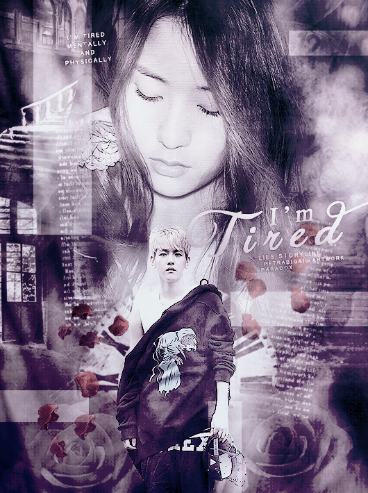
First Impression 8/10: I really thought this was a great graphic. I first saw Krystal which I am sure you were trying to get them to notice her. But I honestly thought that the quality of this poster was a bit off. Something in me felt like something was missing in this graphic.
Mood/Genre 10/10: Your mood was definitely spot on. There was romance and there was angst. I'm sure you could throw in a few more genres such as "mystery, darkness, etc." just by looking at this graphic.
Pictures 5/10: Honestly, I figured this part was the biggest problem. Your stocks were a bit low quality and so was the pictures. They did not look HQ at all and I'm sure you can handle that next time by just choosing photos from HQ websites on tumblr. The emotion on the character's faces were very well done, so I do not have a problem with that at all. You should definitely try not to use too many stocks, but I think you handled that fairly well which makes it alright.
Coloring 9/10: Coloring is great! Nuff said. The roses could have been hued more and the contrast could have been added.
Placement 10/10: Since this is a vertical graphic, your placement was obviously the best place for your characters. The door on the bottom left sort of ruined the moment somehow. I think it would look better if you made the left side symmetrical from the right side. The rose petals did a lot of work for the graphic but maybe hue it just a bit enough for us to notice it.
Font 7/10: The font choice was good, but it can definitely become more improved. The "I'm" was a good default font, but the "tired" would have been better with a different font. The credits were perfect, no doubt. "Tired" was the biggest problem from the fonts. Don't worry, it's not a big deal because it really isn't that bad to start with.
Textures/Patterns 8/10: Your textures were very great, but again, the texture work would be even better with the left symmetrical to the right. Nothing against this one.
Technique 10/10: I think you technique was very well done. You seemed to manage a bunch out of this graphic and that it very good. Great job!
Originality 8/10: Ok, so, since I have seen SO MANY graphics, this isn't entirely the most exciting thing I've seen. Other than the placement, the rest is too common. I know that there is something inside you that you can create a bigger picture in mind. Make sure you try not to get too much inspiration or else your creativity and originality will disappear. You don't want that, right? So, make sure you keep it. I encourage you with originality. Your off on a very great start!
Ending Impression 8/10
Overall 83/100
Reviewed by inspiritkpop.
Comments