SO I TRIED TO IMPROVE IN MY BLENDING AND THIS IS THE RESULT

[you might have no idea what am i talking about, so please read my previous blog firsst]

SOOO, an update about that. lots of people pointed out my flaws and i was so thankful of them <3 i tried to improve in blending. the below poster looks so plain, ikr. dont look at the background (cuz it ) just look at the blending lol

and btw that girl gave me her portfolio link. ill take a few samples out from her album. can you guys compare? compare mine to hers. and she said my poster looked unexpereinced ;;

So this is the improved version (i know it didnt improve much lol but i tried) i tried to make the blend more natural and set more contrasts and curves but the texture is still lacking, i guess ;; can anybody tell me where to download cool brushes like cloud brushes?

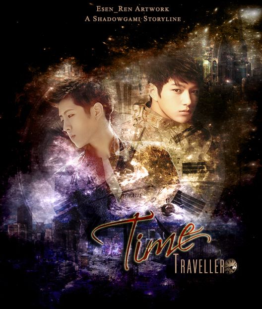
OMG AND OH OH I HAVE ANOTHER ONE I JUST MADE MINUTES AGO. IT WAS HORROR-DARK THEMED AND IM LAZY TO PUT IT UP IN ANOTHER BLOG POST SO I ADDED IT HERE XD RATEE? <3

and this is hers:

i know that mine looks kinda simple and hers look kinda fantasy like, but i dont think the ''colors'' she put in there was neccessary, it looked kinda messy at the first glance but kinda eye catchy :))


please comment your opinion. rate mine and hers :)

Comments

You must be logged in to comment
pathedox--
#1
You improved a lot :)
You have a good sense with the pictures, colouring and typography :)

Rate: 8/10
LJoeyTaemin
#2
tbvh hers i think she took cut photos which made the poster didn't look so well and she, didn't blend the body part there either.
as for you, ASDFGHJKL;; IT'S SO NICE. SHE NO HAVE TASTE.
summerswirlies
#3
you improved! :D
s3xyangel
#4
This is really good!
Kuehki
#5
I really like the first one even though you said it has a plain bg lol but your blending definitely improved, which is all that matters. Are you gonna apply again?
smushy
#6
the first one looks AWESOME *^* abd that one with luhan~ I think you should put something on top... LOL CLOCKS, FLOWERS (RANDOM)
GoodGirl10
#7
I love yours so much!! I think what she means is to fade them out a little more? Maybe I don't really know. Anyways, they look amazing!! You could always start your own graphics shop, I will request for sure!
Neko-Meow
#8
I personally love yours much more. (Y)
littlemisses #9
oh my god. i seriously look up to you now. that is amazing.
hers though... it's kind of messy, and in my opinion, yours is way better.
cherryeol04
#10
I love them!
ButterflyShida #11
tbh... from my sight, you're not too bad.. I'm a new designer but when i look yours, i feel there is something weird but idk what is it and her's is actually something wrong too. And I think my blending poster get many weird looks too.

Rate:

Yours' : 5/10
Her's : 7/10

If me in the rate too.. I think i only get 6/10