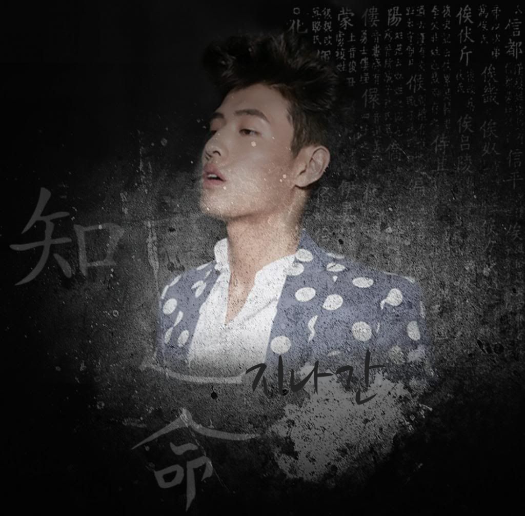
So can i get your honest opinion on this poster? I dont have much practice, but does it look good?bad? i would really appreciate your feedback so i can get better at making posters...
yes, i think its very angst. the shading with the hair was perfect, it doesn't stick out which when making a poster with lowering opacity is hard to do.
hmm i really cant think of too many negatives because i really like this poster of you want some pros and cons the only cons i can think of is the light splatter on his cheek is odd and stick out fake. and the Korean writing with Chinese and Japanese writing is odd but can be excused because many people wouldn't know the differenced. but my biggest problem with the Korean writing is that it sticks out, its not blended very well with the big splatter and if thats the title too small. maybe a litter grey for the word or a different font would go will. matching the font with the picture is very important or else its more a distraction then anything.
if i was a customer i would use this image for my story ^_^ i gave it a 9/10
above is me been absolutely nit picky because you asked for honest feedback
how long have you been making posters? do you have a shop or working in a shop yet?
i think you have alot of talent in making posters
Comments