2015 posters

Click on the picture for bigger size xD

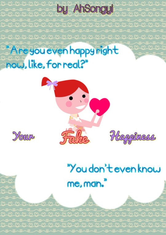
1st: It's simple. Hohoho

2nd: Don't judge the cutting! I was using my phone :') and playing around Dx

3rd: Hmmm............... I can't remove that mark so, whatever. still look pretty nice(for me) xD

4th: Simple :') and cute maybe. Trelelel

Really, no judging please. It has been one year since the last time I did these xD

Comments

You must be logged in to comment
CaptSunRiser
#1
Ok ... please don't hate me for this >_< These are all only my opinions and I don't mean to be disheartening with them. I've done them in reverse order.

4) I really do not like it. I think it's a little too simple, and doesn't look like it's really captivating the reader. I really like the photographic covers I've been seeing elsewhere and I think you could achieve a really good effect with just one photograph.
3) This looks ok if you were just using it to try a different layout, but I don't think the photos and the background texture look good at all, especially coupled with that font. I don't know if you've had a look at Dafont.com for some others (most, if not all, of them are free), but that one I do not like at all. But it's good if you're looking at different layouts.
2) I didn't like this at first, but I do kind of like it now. It looks very scrapbook-y. If you wanted something that looks like the inside of a scrapbook, then you've nailed it, and it also allows the cutting. I get that you were on your phone and phones lack the control and finesse of a desktop or laptop computer, so I am disregarding that, but a scrapbook would have photos cut just like that.
1) I don't get the blue text. I don't know what it says, and I don't like the yellow box there. It looks good in 2), but not 1). It looks like a post-it note there. The photo, however, I love. I think it's a good choice of photo and I like how it's broken up into blocks; I think that's a great effect.
DinoPearl_Riza #2
Niceu~ /thumbs up/
nrlrae
#3
Its good ^^