` ✼ animeotakupooh
` ✼ exotic grounds — graphic reviews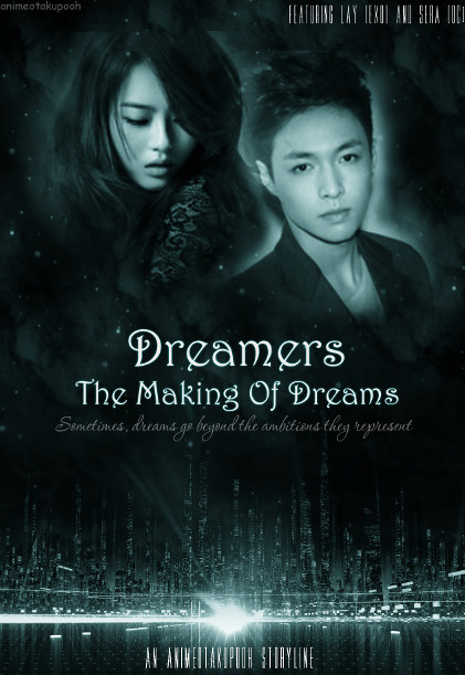
`✼ANIME
OTAKUPOOH
02.21.13
impression (16/20) - it left me a nice impression. it's a bit dark, but it still has the 'fantasy' sense in it.
fonts and colors (17/20) - good choice of fonts and colors. though it looks plain because of the lack of colors, it's still nice.
textures/stocks (17/20) - i love the stock you used. it suits the genre well. good job.
pictures (22/25) - you used pretty good pictures.
overall (13/15) - it's good, but something's lacking. you're good at blending, but you could have erased a little of lay's background or retained a bit more of it. anyways, i like it. :)
bonus (3/5)
88/100!
Comments