` ✼ creamysmiles
` ✼ exotic grounds — graphic reviews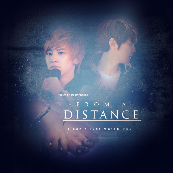
`✼CREAMYSMILES
02.27.13
impression (17/20) - i felt the romance and the sadness in your poster. the blending's just right, the darkness is just right. but at the first glance, it looked more of a fantasy poster.
fonts and colors (18/20) - the fonts you used fit the poster's overall feel. it may look a little plain, but plain fonts effectively make a poster angsty... for some reasons. the color scheme is good. it would have been better if you embossed the title.
textures/stocks (19/20) - the texture, though it's plain and simple, made your poster appealing. good thing you didn't cover it with the characters.
pictures (20/25) - i do think you can find a better picture for chanyeol. he doesn't look sad enough. baekhyun's is already good. also, chanyeol's picture seemed a little redder than baekhyun's.
overall (12/15) - i like the overall look of the poster. i really like your choice of baekhyun's picture. i felt sadness after looking at him. good job.
bonus (2/5)
88/100!
Comments