Beyond the Design?
Yow there, it's zeZehfuh (づ ̄ ³ ̄)づ
Whiewh, my first blog post just cuz I'm bored at work. Seriously, sitting in front of the computer all day is just not so entertaining. And I think people have become more aware of the increasing legal costs to, y'know, actually come and ask for legal advice.
Well anyway, enough about that, I didn't want to rant on the legal world in this post, for today I wanted to talk about my designs! Yeupp!
As most of you guys probs know I run a graphic shop, or more like an artwork shop? called 'Custom Collective' and I make different kinds of artworks! Starting from posters, background, character charts and layouts, and other custom arts. I'm originally an illustrator, y'know those people who do conceptual paintings. I wasn't much of a digital art user at first but then again the 21st century is all about going digital hahaha. And now I'm an avid user of digital art hahahaha.
So, beyond the design huh? I wanted to have an in-depth talk about the meanings (?) behind some of the posters I've made. Without further ado, here we go...
!!WARNING!!
IT'S GONNA BE FULL OF NARCISSISM AND SOMETIMES (ACTUALLY OFTEN) SENSELESS EXPLANATIONS
READ AT YOUR OWN RISK, AND DON'T FORGET TO REPEATEDLY STRAIGHTEN YOUR OWN FINGERS CUZ IT'S GONNA BE CRINGEY AF
1. THE JOKER


This was one of those instances where I actually fell in love with the plot, and made sure I do justice to capture the essence of the story. Anyway, the story is about Jimin who is a criminal with mental problem and his doctor who is determined to cure him. The major element of this poster is the curtain. In both versions there is the kneeling Jimin with black box behind him and white curtains surrounding him. I wanted to show even a criminal as crazy as Park Jimin actually has sides that awaits that perfect someone to 'open up' his 'curtains' for him. The black box behind him shows how mentally sick people are actually 'hollow' inside, so it represents Jimin's hidden heart. Oh btw I got this picture from BTS's Lie trailer.
In the first version, if you zoom in closer, you can see Jimin wearing a cross earring. I used this specific picture to add a bit of ironic flavour in the design. And notice how Jimin's hand is reaching for the title 'The Joker' and his name. This is actually me questioning the author if Jimin's mental problem and all of his criminality is him in all of his sense as a person. It's questioning whether he was really born with all these traits; if he was really like The Joker.
The second version is much more self-explanatory. I added contrasting faces above and below Jimin to represent his psychological disorder. And that's probably it hahaha. I really want to hug BigHits for the Lie trailer cuz all of Jimin's facial expressions just help me do my job ~(˘▾˘~) (~˘▾˘)~
2. LOST AND FOUND
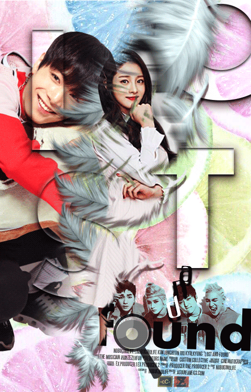
I also like the concept of this story. It's actually about a girl who died, leaving her lover, but came back as a friggin' ghost only to enter the body of his friend. Since it also has a fluff and romance side to it, instead of just light angst, I decided to approach it in a more, err, fluffier way? I didn't wanna be mainstream and not grasping the 'fun' side of the story, and thus that's how I took refugee in lemons and pastel colours hahaha.
I must say I'm highly satisfied with the typography for 'Lost'. I was experimenting a lot on how to make it seem 'invisible' and 'transparent'-ish to represent lost and whiewh, I managed to come up with something glossy like that ( own head). The 'found' typography is pretty self-explanatory, I mean it's quite usual to add the magnifying glass to sort of represent 'found' or... 'searching'? I suppose find and search are synonyms, right?
And since the story is sort of like ghostly, here's how my mind formulated the design: ghost --> death --> angels? --> heaven?, and my brain went feathers!
And to sort of emphasize how the girl is a 'ghost', there's a bit of blurry her in black and white behind herself. Additionally, there's an animation of her footsteps to further add the supposedly ghostly vibe.
3. DESPICABLE BACON

I made this when I was quite obsessed with 3D fonts. Yeah I had those days. And lemme emphasize this once again (hahaha), I'M SO DAMN IN LOVE WITH YELLOWS. When this request came I was screaming with joy. It's got minions (yeah I love minions too beside Mr. Pooh) and them yellows ლ(´ڡ`ლ)
So the story itself is just... crack. So I had to make sure the poster has those 'playful' sides, and lucky me Minions translates to fun. I wanted it to look minimalist so I left the background white just so the rest of the elements would pop out better. In the story, Chanyeol has this overpowering aura over Baekhyun (who had unfortunately or fortunately turned into a minion), so I made him sit like a boss on top of the title. Since the title 'Despicable Bacon' is actually a word play on Baekhyun's name, I thought it would be perfect to show Chanyeol's overpowering aura over him!
Oh and note the little shocking pink beanie that Baekhyun and the minion beside him wear? And how their expressions are more or less the same? Yeah, I wanted to indicate how Baekhyun is a minion in the story.
Well, the banana just needs to be there. It's minions after all.
4. PETRICHOR

This one will always stay in my list of my most beautiful artwork; I can't get enough of looking at it (yeah, call me narcisstic I'm cool with that ƪ(˘⌣˘)ʃ). The story itself has this greek mythology (if I'm not wrong, trust me I'm always confused if it's greek or roman mythology, forgive me I failed my history and geography subjects during highschool) background, so I had to make sure the poster captures the 'elegance' and yet don't lose the 'romance'.
Jvnghseok-nim, the writer, actually requested for pastel colours and simplicity. I'm really grateful for the choice of photos too, they just fit so beautifully it makes my job easier! The only thing I had to contemplate on is the typography. I had to choose something that represents the meaning of petrichor; it has to have the feel of 'rain' but at the same time the feel of 'rain has stopped', but it can't be the usual gloomy after-taste. It has to has 'hope' and the 'soft romance'. What the hell am I saying? Well anyway, I fell in love with that word becuz of this story hahaha.
5. THE IDEAL ACT

This is actually a Wattpad story BUT I HAD TO WRITE ABOUT THIS CUZ IT HAS THE INVOLVEMENT OF THE LEGAL WORLD somehow... (っ˘ڡ˘ς). Damn, I'm shameless.
Anyway, I'm gonna drown in angsty feels if I look back on this story. It's about how the new president brought out a parliamentary act to terminate all homouals in the USA (gosh I'm getting emotional). The author gave me three things to consider; a kissing couple, shooting soldiers, and cityscape. And so I decided to stick with cool colours (a lil' note; blue hue is cool, red hue is warm) and have the couple kissing in front of the surrounding soldiers with guns pointed at them. I think it's, again, self-explanatory cuz it shows how the army community, which should be acting under the president's order, is highly against homouals. The soldiers pointing guns at the couple shows how much hatred is held for them, but then they stood there locking lips.
I tried to make the typography a bit ruggish (?), so it has to look like it has been shot numerous times with a bullet. Believe me, I was still in the 3D font fever.
And then I closed everything off with a crack of glass (which is actually cracked by a bullet) to further emphasize the two main characters.
6. LOVE ME RIGHT

One of my earlier 'dark' poster. The story has 'tish' and 'thriller' vibe to it, and so cool pallete is the answer tehee.
I made Baekhyun huge at the back to emphasize his desire to 'capture' the girl. That goes for the locked chains on top of her as well. I was actually debating on the girl's expression, cuz she has this hard-to-get personality but at the same time later in the story I believe she's gonna be submitting herself to Baekhyun. And thus after endless debate (with myself) I decided to capture the latter. I have to admit her expression fits the colour scheme. I also used shattered glass to actually indicate how Baekhyun is going to shove through her defenses and shatter it alltogether.
For the typography, I tilted the last 'T' in 'Love Me Right', cuz I wanted to add a bit of questioning flavour to it. And then if you increase the brightness of your screen a bit you can see the words 'by pleasuring me' behind the title hehehe.
7. TOUGH KOOKIE
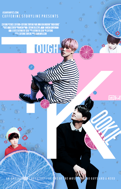
Whee, a poster I just made recently. It's not Yoonmin or Vkook but, it still has my favs in it so I'm happy. Dang I'm too easily pleased...
Anyway, the genre is (raises eyebrows provokingly ( ͡° ͜ʖ ͡°)), but the author wanted the poster to capture the fluff and romance side of it, and have Jungkook chasing after Jimin. So I took it literally. But I decided to add a bit of irony in it. Fortunately, the story has this special 'ranking' system where Jungkook is actually Rank 1 and Jimin is Rank 4. And so I thought, let's have Jungkook looking up at Jimin instead!
This poster is seriously a result of my fluff formula. Like seriously, whenever I deal with fluff, it's always pastel plus lemons or berries! But I since I like lemons a tad bit more than berries, I'm using more lemons this time too...
I also added the little 'pissed off' animation on Taehyung and Yoongi who are busy looking at the two lovebirds at the centre. And if you zoom in to the movie-like thing on top of the 'T', it actually has real credits of the author and such and such HAHAHA.
8. INCUBUS

Ehem. My super long awaited Yoonmin request tehee! As much as I love Hoshi-nim, I worship this couple just so so much. Once I surfed the net too long for them I started believing they're real. I mean, there's no way they don't. Yeah #shameless.
Honestly, Dracula-nim, the author, had already picked the photos she'd like to use, and one thing she requested was for a rose to be added. Since the genre is (I mean come on what's Yoonmin without ???) I had to make sure it's up and hot. And thus I decided to use warm colours! Yepp, them red hues finally on motion muhaha. But then I didn't want to be mainstream (HAHA whut) so I didn't put a stalk of rose, and instead I placed a bunch of rose petals ( ͡° ͜ʖ ͡°). If you're sharp enough, you can see Jimin and Yoongi on the background, Jimin on the right and Yoongi on the left. I wanted to capture the 'hot' in different way, so what I did was that I flipped the colours of background Yoonmin. What I mean by 'flipping' is that, you see in the world of colours there's this something called colour wheel (?), something like this;
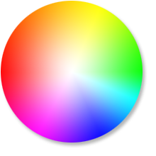
So I simply flipped the originally cool colours to a much warmer hues. As you can see the blue hues are directly opposite of red hues. So whatever originally blue was changed to red hues. And so on.
The typography! Dang I love the typography in this piece (I'm so narcisstic I apologize). I actually wanted to make it look like korean calligraphy brush style, but then since the title is 'Incubus' I kinda wanted to have a bit of modernistic flavour in it. And so I decided to combine the two hahaha. So I mixed the Sans Serif type font and hand-drawn the calligraphy-kinda parts. I'm satisfied with the finished look tho hehehe.
And tbh I'm lucky that Dracula-nim changed the title to 'Incubus' (originally it was Spell? Or something like that), cuz damn the vibe fits the rectangle in the middle perfectly hahahaha.
9. STOP LOOKING AT ME
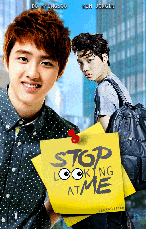

When this request came in I thought the story was the usual college-fluff BUT it turned out I was completely mistaken. The first version was way too bright and the author came back to request for a more angsty version. And thus that's how I begun working on the second version.
I kept the typography the same cuz I liked how the glasses blend as alternative 'O's, the only alteration I made was making it more transluscent so it had that soft and angsty feel to it. Tbh I didn't know why I added the flowers... or why did I add such effect to the flowers... hmmm...
But anyway I changed Kai's photo to the one that grasp more of 'dem angsty vibes (thank god he has this photo). I also used tale green as the overall pallete becuz I thought it would fit light angst the best, instead of darker and fiercer colours that is usually used for angst.
I believe I talked (or wrote) a lot already hahaha. Gotta go back to work.
Cheers!
Comments