Tips and tricks #1 (RomCom)
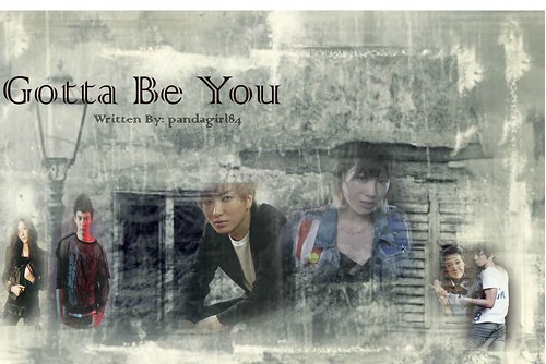
× Je t'aime // graphic tutorial#Rule one // to make a happy poster requires a lots of patterns, stocks, random pngs, creativity and most importantly, colors. The poster need to be clean and perfectly organized,and at the same time eye catching too. Something like this will help.


click and drag to a new tab for a better view.
#rule two // always use a png image for the characters. however, there are things that you should keep and eye for. First of all, please make sure that a little part of the model's head is not cutted off. always go for a full body png. you know what I mean? (example on leeteuk's picture in this poster)
#rule three // experiment,experiment, and experiment. Try out for a new style. you'll never know what's outside those comfort zones ^^
#rule four // the characters need to be charismatic. wether it will be sad, angry, pouting, shocked, scared etc. but still, make sure there's still a little bit of cuteness in it


#rule five // to position and edit the characters is such a pain in the a**. but there is alittle bit of magic tricks that will help. you can make an outline for the chracters, like this! or giving it a little bit of shadow-ish effect like this! it really worked to give the poster a happy feelings.
#rule six // use the right fonts. you knoe those cute and gunny texts used it cartoons and live-action shows? you can download those fon'ts on dafont.com. but here's a little bit of advice before you download the fonts tho, try to search for the fonts tagged as fancy>comic or fancy>cartoon. usually they have the best font for comedic posters.
#rule two // always use a png image for the characters. however, there are things that you should keep and eye for. First of all, please make sure that a little part of the model's head is not cutted off. always go for a full body png. you know what I mean? (example on leeteuk's picture in this poster)
#rule three // experiment,experiment, and experiment. Try out for a new style. you'll never know what's outside those comfort zones ^^
#rule four // the characters need to be charismatic. wether it will be sad, angry, pouting, shocked, scared etc. but still, make sure there's still a little bit of cuteness in it
#rule five // to position and edit the characters is such a pain in the a**. but there is alittle bit of magic tricks that will help. you can make an outline for the chracters, like this! or giving it a little bit of shadow-ish effect like this! it really worked to give the poster a happy feelings.
#rule six // use the right fonts. you knoe those cute and gunny texts used it cartoons and live-action shows? you can download those fon'ts on dafont.com. but here's a little bit of advice before you download the fonts tho, try to search for the fonts tagged as fancy>comic or fancy>cartoon. usually they have the best font for comedic posters.
Comments