elf_verl - The Many Faces Of Love
★*・゜゚・*Sparkle Heaven Request Shop*・゜゚・*★[CLOSED][Check the last chapter for details of our new shop Thanks!]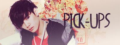
Review completed for elf_verl:
Title: The Many Faces Of Love
Title (5/5) – The title is unique and alluring, it has that mysterious feel which is great for a story. It isn’t cliché but it still has the feel of sadness.
Foreword and description (7/10) – The foreword has many one-liners which if used correctly, will have a great effect on readers however I think you have used too much so it doesn’t really tell what is the basic plot is. I absolutely love the big paragraphs, because initially it will be the foreword/description that will make the readers subscribe or not so if you add more info, the readers are probably going to be more intrigued. However when adding colors to the font, make sure you match those colors because when you use too much varieties of colors, they often seem confusing and scattered.
Appearance (8/10) – The appearance is very colorful and vibrant, using masses of color. In order to make it even better, you could specifically chose a set of colors so it matches together on the whole.
Creativity/Originality (7/10) – It is a typical love story so it isn’t really original, I could sometimes predict what was going to happen next making it quite useless for me to read the next chapter. The reason it isn’t lower than seven is because of the words you used that are really descriptive and creative. For example, using 'bolted', 'stumbling' rather than walking is a good way for the readers to visualize what was going on.
Poster and Background (4/5) - The background and the poster match creating a smart look towards the story however maybe you could have use say, black or dark colors since the story is sad and angsty. You have two posters so in order for the story to look more appealing, maybe only have one so the readers can focus on that one. Looking individually, both of the poster are well made, they have at light colors seeping making it sad yet mysterious luring the readers more. Pictures are always a great way to persuade the reader to read on so the poster is well thought of.
Story Flow (3/5) - I was captivated at first and I wanted to read on but it lack during the next few chapter because of how slow it was progressing. Adding more drama urges the reader to read on especially since this story is quite sad and angst. True enough, at first, it was in a steady pace. I know what was going on but especially after chapter three, it was stuck in that moment and not really progressing.
Grammar/Vocabulary/Punctuation/Spelling (27/30) - The range of the vocabulary is excellent, clearly defining the descriptive words used. Although they were a few spellings mistakes in the foreword and some of the chapters which deducted your points, the grammar was good as well. Be careful to use present, past and future accurately. The punctuation on a whole was good; check that you got commas in the right places.
Writing Style (4/5) - It didn't have switched POV's all the time which was great and moreover; it was in third person so the readers would not get confused however when making these kind of stories, it would be more helpful if you perhaps have a certain person's point of view since the feelings are replicated better. Apart from that, the writing was well checked and I really could imagine the story beholding itself.
Characters/Description of Characters (9/10) - The characters were perfect in the way of showing their personality. I can easily summarize their personalities which is a good thing author could do for the readers.
Ending of Story (--/5)
Overall Enjoyment (7/10) - The suspense was thrilling in the first chapter and I enjoyed reading the whole story. I can just say it was one of the best descriptive techniques used and the imagery was very powerful. Even better if you make the story progress quicker with more plot added.
Total score: / (81/100)
Comments