3 Graphics from the last 2 days

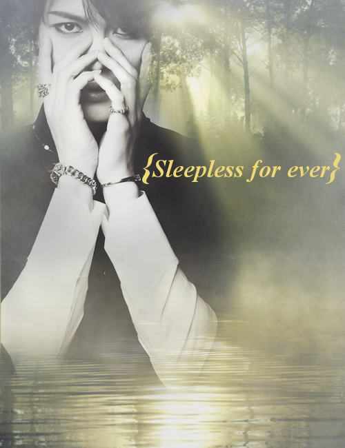
This is the first (and best) edit I made. {Kim Jaejoong}

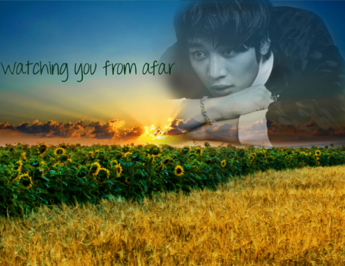
I don't know about this one, nothing really fits and I'm really dissatisfied with it...

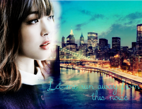
I like the colors of this one.... Tho the text is not easy to read T-T (and I really like the sulli picture mwahaha)

Please, write me your thoughts about my edits. I'm a bit out of practice, since the last edit I made (which wasn't a poster) is about 3-4 months ago ^^"

Comments

You must be logged in to comment
hanjae_elf
#1
The first and third are really pretty ^-^ The Jaejoong-edit is honestly the best~ Regarding the colours of the last one, well, I love the colours xD The text part 'this noise' is easier to read since it covers a much darker area. I wouldn't say it's difficult to read at all. Maybe if you move the whole text downwards a bit (more on the dark blue~) it would be more to your liking ^-^?
The second one (Minho), I don't really know what's up with it. Sorry, but it doesn't fit, idk. For me, especially the sunflowers right next to this field catch my eye. Too strong colours? Perhaps a more calm environment would be more suitable. Also, Minho's expression distracts - the pic is handsome whatsoever ;) He looks very playful, maybe even mischievous xD The pose is good and fits, though :)
Actually, I have no right to correct as I know very little to nothing about such things ^^' Hope, I could still help you...somehow :)