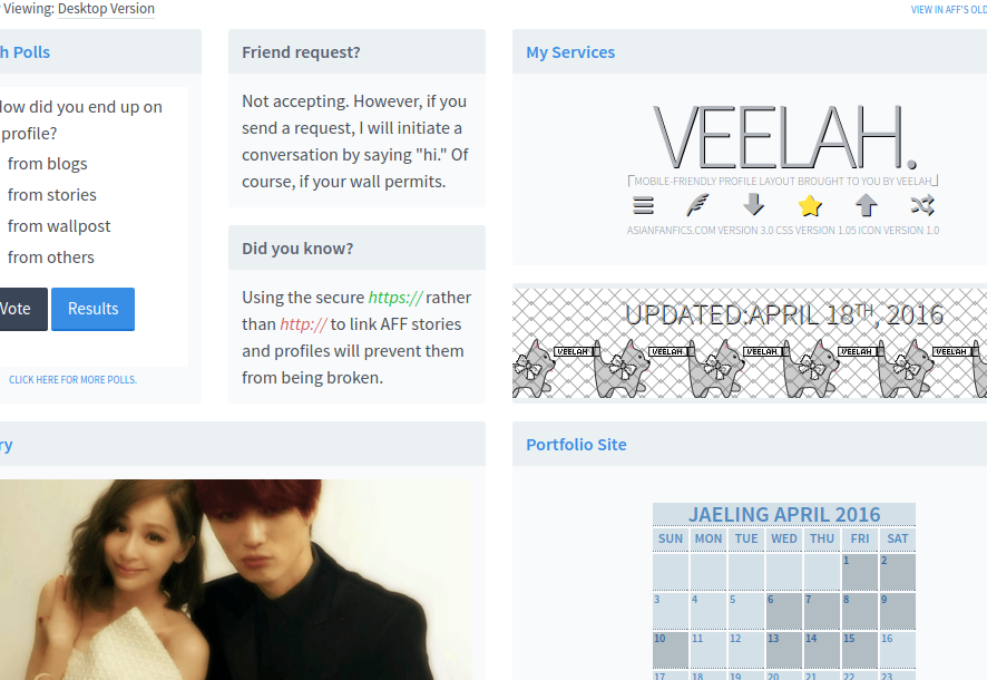
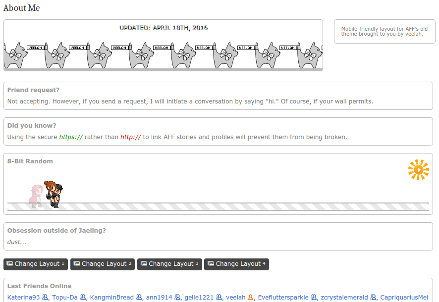
(6) Veelah's AFF secrets.


There used to be a problem with emoticons distrupting comments. If you enter a smiley on the phone, the rest of your comment after that smiley is done for. To fix this problem, codes now show in comment section, PM, and wall posts. Speculation. LOL. But, anyway... for stories and blog posts, there's still no easy way to show codes... sure there's the silly < div> spacing like that. I'm always shaking my head every time I see it. SMH Instead of inserting a silly space, just insert <i></i> or any other opening/closing tags. That opening and closing tag will disappear leaving you with <div>. You can just copy codes directly without having to fix those spaces. Of course, there's an easy way to get ride of all those spaces after copying the broken codes, but we're not addressing that right now. LOL.
So... example:
Typing in: <<i></i>div style="text-align:center;">&<i></i>nbsp;<<i></i>/div>
will appear on the chapter or post as: <div style="text-align:center;"> </div>
That's how I've been showing the codes in Secret T#1. You can directly copy those codes with no extra step.
CLICK TO VIEW THIS BLOG ON NEW THEME (Can you spot the difference after switching?)
Basically, there is a way to show the same page, but with different content. How can this be helpful? It's a useful thing to know if you code layouts on AFF especially for those using the Layout Marketplace. You can make two separate layouts, one best viewed on new theme and one best viewed on the old theme, in one single marketplace layout.
<div class="comment_reply">
layout codes for new theme
</div>
<div class="dropdown">
layout codes for old theme
</div>
The function of 'comment_reply' here is to hide whatever is inside that div when in old theme. The function of 'dropdown' here is to hide whatever is inside that div when in new theme.
I have applied this to my profile layout. I made two separate layouts. One for new theme and one for old theme. So when switching from new to old and old to new, one or the other will hide away. This is what it currently looks like in new theme:
*sighs* downside... difficult to make old mobile-friendly with new theme layout still tagging along. Sure, it's hidden... but that doesn't mean it's not there. LOL
CLICK TO VIEW THIS BLOG ON OLD THEME (LOL, do it and try to spot the difference)
Basically, there is a way to show the same page, but with different content. How can this be helpful? It's a useful thing to know if you code layouts on AFF especially for those using the Layout Marketplace. You can make two separate layouts, one best viewed on new theme and one best viewed on the old theme, in one single marketplace layout.
<div class="comment_reply">
layout codes for new theme
</div>
<div class="dropdown">
layout codes for old theme
</div>
The function of 'comment_reply' here is to hide whatever is inside that div when in old theme. The function of 'dropdown' here is to hide whatever is inside that div when in new theme.
I have applied this to my profile layout. I made two separate layouts. One for new theme and one for old theme. So when switching from new to old and old to new, one or the other will hide away. This is what it currently looks like in old theme:
Will add this to my secrets blog... when I can deal with fixing the stuff on there.
This tip is for the following AFF members:
- Readers who click on a link and are redirected to an invalid story ID page.
- Authors linking to other AFF stories and profiles within their story.
If you end up seeing a page like this:

Delete one of the view/ in the address bar (the words behind the storyID# does not matter, you can delete it or keep it there).
broken link: www.asianfanfics.com/story/view/view/storyID#/
fixed link: www.asianfanfics.com/story/view/storyID#/
Press ENTER or click GO.
I have also seen when story/ is duplicated. Simply remove one of them and go.
If you wish to help the author and others like yourself, please ask the author to kindly do the following:
Relink the story, profile, or whatever the broken link is. After entering the URL, make sure that https:// is selected. Do not use the insecure http://.

With the secure https://, the link will not break. It is safest to use the secure address ALWAYS.
I totally forgot about this one until I ended up on that damn invalid page again today, lolololo... will add this to my secrets blog in a day or two.
This tip is for the following AFF members:
- Members who have their entire profile set to friends-only, but still wish to place a message viewable to all (including non-friend members and non-members).
- Members who wish to have their entire profile hidden from non-friend members and non-members, but may not be aware that there are still information being made available to the general public.
I am just going to say it. The "About Me" section will be viewable to anyone and everyone... even if you have your profile on friends-only. If there is something you don't want non-friends and non-members to see... do not put it in the "About Me" section. Put everything in the "Personal Message" section.
For those who wish to have part of their profile visible to everyone... even with your profile on friends-only... remember... "Personal Message" section is hidden for non-friend members and non-members. "About Me" section is viewable to all.
I was going to bring this up with Nichiren, but then, I remembered. He decided to fix the PM privacy issue after all. LMAO
If you know basic html, you'll know that even with members-only and subscribers-only restrictions applied, anyone (non-members and non-subscribers alike) can freely view your chapters in its entirety. There's, certainly, a way to heighten security, made possible by a new marketplace layout change implemented earlier this year.
I will use my subscribers-only story as an example. Since I'm looking for a very specific audience with particular qualities (extra curious readers interested in historical fantasy adventures), this set up works for me. Hide everything from view.
So... non-members and non-subscribers will see this when viewing chapter two:

If they try to see the chapter text by viewing the html code, they will see this instead:

Subscribers, of course, will see the chapter in its entirety (minus the fun 'haha, access denied message').

Here is the general idea. Since Nichiren has disabled marketplace layout for non-members and non-subscribers to members-only and subscribers-only stories, it is possible to write your chapter as a layout, mark it draft/unlisted, buy it, and apply it. Non-members and non-subscribers will be unable to view the layout, therefore, they will be unable to view your chapter text.

If you wish to have a piece of your chapter viewable to all, this method can be easily modified. Type out the first paragraph (or whatever preview you wish to share with everyone) in the actual chapter... while typing up the rest in the layout and applying it to the chapter.
I will not be going into details on how to use marketplace layouts because, LMAO no thanks. There's already instructions in the AFF FAQ and the actual "layout creation" page.
This is for advanced coders only. This is not a step by step, I'm going to walk you through like a baby, thing. Those who are just learning stuff... this is so not for you.
General tip about making mobile-friendly layouts: Try to always use percentage for widths especially the actual widths of divs... margins... I guess you can use pixels for padding... just to feel less relative in life and more absolute in coding. If you must make a div with a definite width, no more than 260px... possibly floating here and there at the corners with margin:% and when you resize the screen, it comes together.
The stuff above should be straight forward. The stuff below may not be so straightforward. I will be showing you how to use already specified stacking/horizontal splitting classes on AFF.
Stacking
Okay, let's get right down to mobile-friendly business.
ONE
Column 1 Line1Column 1 Line2
TWO
Column 2 Line1Column 2 Line2
Column 2 Line3
THREE
Column 3 Line1Column 3 Line2
Column 3 Line3
Column 3 Line4
The "stack" and "sympl" classes are being used here along with a width specified class "onethird" aka 33.333333333% width. If you re-size the screen, you will see that the three columns will stack on each other to become one column.
<div class="sympl onethird" style="text-align:center;">
<h2>ONE</h2>
Column 1 Line1<br />
Column 1 Line2</div>
<div class="sympl onethird" style="text-align:center;">
<h2>TWO</h2>
Column 2 Line1<br />
Column 2 Line2<br />
Column 2 Line3</div>
<div class="sympl onethird" style="text-align:center;">
<h2>THREE</h2>
Column 3 Line1<br />
Column 3 Line2<br />
Column 3 Line3<br />
Column 3 Line4</div>
</div>
Parent div will carry the "stack" and "sympl-stack" classes. Child divs will carry the "sympl" and "onethird" classes.
You can pretty much divide the columns however you want up to six equal columns. Six "onesixth" divs.
Examples of equal columns classes:
Go ahead and re-size the screen to see how they stack again on mobile screens
You can also make... different width columns and still have them stack equally on mobile. Examples:
You can see the pattern in the width classes: quarter (25%)..... half, twoquarters, threesixths (50%)... etc.
Stacking Images
The down side of the "sympl" class is probably that left padding. You can easily solve this by giving the div with the "sympl" class zero padding. Up next... lined up images that stacks upon re-sizing to a mobile screen width.


Go ahead and re-size. You will notice the images will go back to being the maximum size the current screen will allow (that is... if your image is large enough to cover the width). If you don't like the spacing in between the pictures, simply give the image a negative margin-bottom.
The basic codes:
<div class="sympl onefifth" style="text-align:center;padding:0px;">
<img alt="imagealt" src="imageurl" /></div>
<div class="sympl onefifth" style="text-align:center;padding:0px;">
<img alt="imagealt" src="imageurl" />
</div>
<div class="sympl onefifth" style="text-align:center;padding:0px;">
<img alt="imagealt" src="imageurl" />
</div>
<div class="sympl onefifth" style="text-align:center;padding:0px;">
<img alt="imagealt" src="imageurl" />
</div>
<div class="sympl onefifth" style="text-align:center;padding:0px;">
<img alt="imagealt" src="imageurl" />
</div>
</div>
In-between Screen
Side Column
Lots of blue here because Rose likes blue which is always relevant to everything. Now... there is such a thing as a screen in-between desktop and mobile. It's like... a wider mobile... which has been given the letter "L" to represent it. So... when I put the class "onefifth," "l-quarter," and "m-full" in the same div, I'm pretty much telling that div to be one-fifth of the screen when on desktop, re-size to one-fourth of the screen when in-between, and turn full width when in mobile. The side column div you see on the left has been given the class="sympl onefifth l-quarter m-full" while the main column/container (this one) has been given the class="sympl fourfifths l-three-quarters m-full".
Re-size the screen all the way. The side column will stack on top.
<div class="sympl onefifth l-quarter m-full" style="color:#fff;padding:0px;">
<div style="background-color:#3366cc;">
<div style="margin-left:20px;">
<h3 style="color:#fff;">Side Column</h3>
</div>
</div>
<div style="background-color:#0099ff;">
<div style="text-align:center;">Line 1</div>
</div>
<div style="background-color:#0099cc;">
<div style="text-align:center;">Line 2</div>
</div>
<div style="background-color:#33cccc;">
<div style="text-align:center;">Line 3</div>
</div>
<div style="height:5px;"> </div>
<div style="background-color:#0099ff;">
<div style="text-align:center;">Line 4</div>
</div>
<div style="height:5px;"> </div>
<div style="background-color:#0099cc;">
<div style="text-align:center;">Line 5</div>
</div>
<div style="height:5px;"> </div>
<div style="background-color:#33cccc;">
<div style="text-align:center;">Line 6</div>
</div>
<div style="height:5px;"> </div>
<div style="background-color:#0099ff;">
<div style="text-align:center;"><img src="imageurl" alt="imagealt" style="margin-top:6px;"></div>
</div>
</div>
<div class="sympl fourfifths l-three-quarters m-full" style="padding:0px;background-color:#99ccff;border-width:10px;border-style:solid;border-color:#3366cc;">
<center>
<div style="width:96%;margin:10px 0px 10px 0px;background-color:#fff;color:#3366cc;">
<div style="padding:10px;text-align:justify;">CHAPTER TEXT</div>
</div>
</center>
</div>
l-width classes: l-full, l-half, l-onethird, l-twofifths, l-threesixths... etc. the only one that is inconsistent with the rest is l-three-quarters... You got l-quarter, l-twoquarters... and then suddenly l-three-quarters. But... whatever.
Note... if you put the side column on the right, it will stack below the main column/container. And don't float the sympl divs... that's just weird. And don't mind the .98 opacity and flashing background. That's just me.
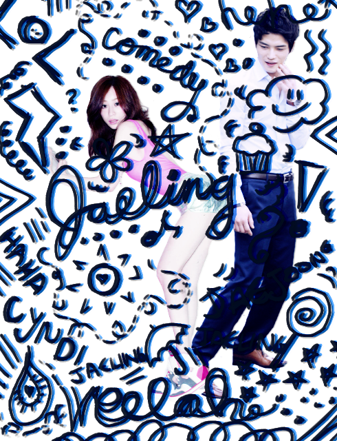
Ex. Image Stack

Jaejoong and Cyndi pictures or at half screen for desktop, in-between, and full screen for mobile. Boys Republic are onefifth of the screen each for desktop and in-between... and full screen for mobile. You will probably rather not see the codes to this because LMAO... but... let's go.
<div class="gritter-title profile__title profile__title--online" style="float:left;font-size:10px;width:40px;letter-spacing:0px;word-spacing:0px;padding:10px;">ONLINE</div>
IDOL BATTLE DOME</div>
<div style="background-color:#3b0f2a;height:30px;"> </div>
<div class="stack sympl-stack" style="background-color:#05011a;line-height:1;">
<div class="sympl half l-half m-full">
<img alt="KING" src="https://1.bp.blogspot.com/-DK-j4SZ9D_c/Vv8ESFkq0DI/AAAAAAAAFws/a5sGIBkDcxMo9UiyHmh_QfVq_5nH2jx4g/s1600/fullking-min.png" style="margin-bottom:-35px;" />
<div class="gritter-title profile__title profile__title--online" style="padding:10px;color:#fff;">KING JAEJOONG</div>
</div>
<div class="sympl half l-half m-full">
<img alt="QUEEN" src="https://3.bp.blogspot.com/-uYYfFT-cTRY/Vv8ETMGFMSI/AAAAAAAAFww/NVHBGwYzkLYoyM8rhEtVF7_wCrVRd2k5g/s1600/fullqueen-min.png" style="margin-bottom:-35px;" />
<div class="gritter-title profile__title profile__title--online" style="padding:10px;color:#fff;">QUEEN CYNDI</div>
</div>
</div>
<div style="height:30px;background-color:#05011a;"> </div> <div class="stack sympl-stack" style="background-color:#05011a;line-height:1;">
<div class="sympl onefifth m-full">
<img alt="KNIGHT" src="https://1.bp.blogspot.com/-7wWFVIlVdZY/Vv8ERoq8a4I/AAAAAAAAFwo/7ab7NmQ9JKMpMCQIuZbT8c8JWS6YAM96g/s1600/fulloj-min.png" style="margin-bottom:-35px;" />
<div class="gritter-title text profile__title profile__title--online" style="padding:10px;color:#fff;">KNIGHT WONJUN</div>
</div>
<div class="sympl onefifth m-full">
<img alt="KNIGHT" src="https://1.bp.blogspot.com/-zZsjc_tmhU8/Vv8EUKHIrZI/AAAAAAAAFw8/Rb0bVwC3eLMc-O053leWYBirddjSsKzWQ/s1600/fullsw-min.png" style="margin-bottom:-35px;" />
<div class="gritter-title profile__title profile__title--online" style="padding:10px;color:#fff;">KNIGHT SUNWOO</div>
</div>
<div class="sympl onefifth m-full">
<img alt="KNIGHT" src="https://1.bp.blogspot.com/-DsJ9UHRwiE4/Vv8ETR717KI/AAAAAAAAFw0/08tsOeUZq04aGXwNgs2XZrFA42Gz7NhRQ/s1600/fullsj-min.png" style="margin-bottom:-35px;" />
<div class="gritter-title profile__title profile__title--online" style="padding:10px;color:#fff;">KNIGHT SUNGJUN</div>
</div>
<div class="sympl onefifth m-full">
<img alt="KNIGHT" src="https://3.bp.blogspot.com/-ZJklu_fPavk/Vv8ERbOcuqI/AAAAAAAAFwk/aJlovSrVgsgjvwm8CNeqGLBSc3UpQnx1Q/s1600/fullms-min.png" style="margin-bottom:-35px;" />
<div class="gritter-title profile__title profile__title--online" style="padding:10px;color:#fff;">KNIGHT MINSU</div>
</div>
<div class="sympl onefifth m-full">
<img alt="KNIGHT" src="https://3.bp.blogspot.com/-I7NN7ZDpBK8/Vv8ETxBQ7OI/AAAAAAAAFw4/FudX3RAOhcUq8g-Z-UuEjmWfpaVsODu6A/s1600/fullsu-min.png" style="margin-bottom:-35px;" />
<div class="gritter-title profile__title profile__title--online" style="padding:10px;color:#fff;">KNIGHT SUWOONG</div>
</div>
</div>
<div style="height:35px;background-color:#05011a;"> </div>
<div style="background-color:#3b0f2a;">
<div class="gritter-title" style="padding:10px;color:#fff;text-align:center;">UPCOMING MATCH AGAINST: QUEEN A-YEON/KING BERNARD/GOT7 KNIGHTS 12PM KST</div>
</div>
This was originally posted in place of The Jaeling Arena as an April Fool's.
Comments


you'll see me around maybe :D
ps. i want to ask you a bunch of questions ^^ I totally wonder how you found out all this OuO
-totally going to come back here another day hehehe--
vigour led me here and I'm so glad she did O_o
I am in awe, thank you so much for providing all this! I went through some of your other blogs and your profile as well (and I may or may not have stalked you in the comments, sorry, I know it's lowkey creepy af), and I just can't get over how amazing you are!
How did you learn about all these classes? Like do you study the code for aff? And do you mind teaching me a few things? I'm v eager to learn O-O


Thank you for this-- this is amazing, truly.

Thank you for your hard work, veelah!

//sigh
████████████████████████████████████████████████████████████████████████████████████████████████████████████████████████████████████████████████████████████████████████████████████████████████████████████████████████████████████████████████████████████████████████████████████████████████████████████████████████████████████████████████████████████████████████
██████████████████████████████████████████████████████████████████████████████████████████████████████████████████████████████████████████████████████
██████████████████████████████████████████████████████████████████████████████████████████████████████████████████████████████████████████████████████
██████████████████████████████████████████████████████████████████████████████████████████████████████████████████████████████████████████████████████
██████████████████████████████████████████████████████████████████████████████████████████████████████████████████████████████████████████████████████
██████████████████████████████████████████████████████████████████████████████████████████████████████████████████████████████████████████████████████
██████████████████████████████████████████████████████████████████████████████████████████████████████████████████████████████████████████████████████
██████████████████████████████████████████████████████████████████████████████████████████████████████████████████████████████████████████████████████
██████████████████████████████████████████████████████████████████████████████████████████████████████████████████████████████████████████████████████
██████████████████████████████████████████████████████████████████████████████████████████████████████████████████████████████████████████████████████
██████████████████████████████████████████████████████████████████████████████████████████████████████████████████████████████████████████████████████