I have been creating covers for my own stories. Feedback?

I guess it's just me but I have been making my own stories and one thing I realized throughout the process is that I make posters as I conceptualize the story. And before I start writing, the story has got to have a nice cover. Since most shops (if not all) require the story to be published before accepting requests, I figured I should make my own. I can do it. I'm kind of well-versed in the Adobe creative suite so I have been making my own stuff.

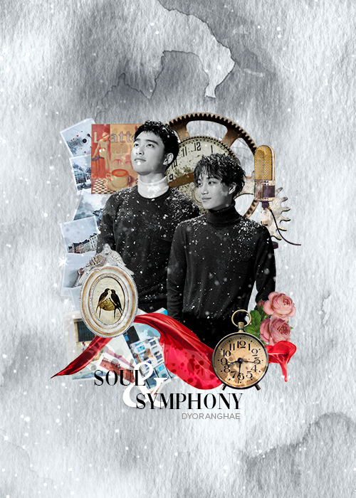
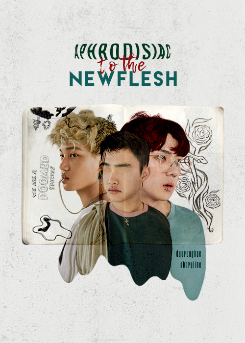
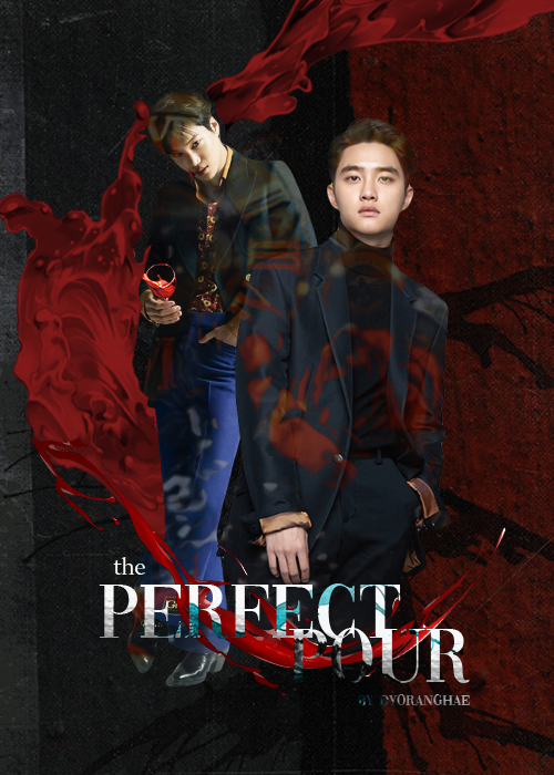
Here are some of the stuff I came up with myself


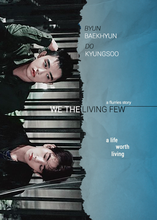
I am still working on my editing techniques but I have been mostly inspired by movie posters (especially for We The Living Few). What do you guys think?

Comments

You must be logged in to comment
lilacyouths
#1
Hi! I'm just a random stranger scrolling through the blog tags so don't mind my criticism if they're too harsh unu
1) Love the concept but idk what message it's supposed to give. I'm guessing it has something to do with memories because the vibes look kinda nostalgic + the appearance of a clock and a gear?? Imo it'd be nicer if the tone was warmer rather than b&w with colourful pngs (the bright reds became the emphasis of the poster because it's so bright and everything else are so muted; not a good thing because you'd want the viewer's eyes to go to the people first). Nice font btw!
2) AAAAAAA it's so perfect like- it's so artistic?? And each element really complements one another. I love how the bodies end with a drippy curve instead of just chopping it in a straight line LOL. It's my favourite uwu
3) I love thissss *O* the only thing kinda off from this is mayhaps the text hierarchy? In this case it should be title >>> subtitle > cast > credits. But in this poster, the hierarchy is blurred from one another. Try playing around with sizing of the fonts!
4) Nice composition! I personally would nudge the title up a bit but it still looks nice this way (also overlapping of the title fonts isn't really a good idea especially if it's filled with pattern, that makes it even harder to read if the poster isn't really large). The only thing I found jarring was the colouring, like there were too many saturated colours going on at once? PSD colourings (you can find lots of these on deviantart, but not every psd works on every poster) and photo filters help a lot with these!

Again, I'm just a random stranger popping out of nowhere but I hope it helped without offending you ;n; sorry in advance
Sway10
#2
looks really nice!
Thesydney
#3
Also, I didn’t realize who you were at first because of the username change! But I don’t think I have your poster up for your entry! I’ll change it today
Thesydney
#4
Ah I really like these! Especially We The Living Few!!! I love the side ways view of it!
The second one also has a really cool format to it!!
Have you thought of opening a shop?
ann1914
#5
These are nice! I love the poster for We The Living Few. Keep up the great work. :D

Yeah, as a graphic shop owner, I preferred to have a story link provided before making a request to make sure the graphic will actually be used. Had a lot of people say they were gonna make/undraft the story after picking up the graphic but they never did (or deleted them). That was just saddening. It's nothing personal but since it happened a lot, I eventually added that rule (provide a story link first).