POSTER TUTORIAL; Simple, but Cute Poster by b2utiful-day.
GIMP Innovations
Hi , it's me, Steph!
In this tutorial, i'll show you guys how to make a simple, but also cute poster.
here's an example:

STEP ONE:
The easiest step.
Opening up your new canvas.
Portrait is better for this type of poster, but if your really want to, you can do landscape.
480x640 is a good size to use.
it's one of the sizes that I use that most.
(please don't tell me you don't know how to open up a new canvas.)
STEP TWO:
Select the "blend" tool.
then, change your foreground color to a nice, pretty color.
Make sure it's not too bright, or not too dark.
A color like this will do:
(33bfff)
Then, change the background color.

pay careful attention to this part!
when you click the bg color, this window will appear.
click on the first little color icon. (the color should be the one you chose for your foreground color)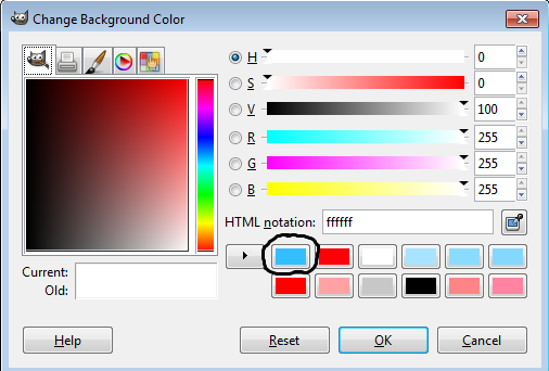
your window should look like this: (depends on the color though)
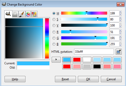
forget all the other weird options and just look at this one:

slide the little bar thing to the left so you have a lighter version of your foreground color.
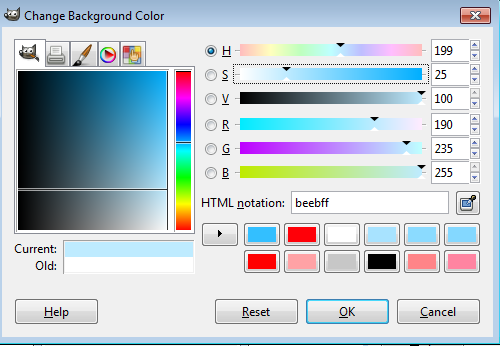
press ok.
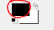
your foreground and background colors should look like this (unless you chose a different color)

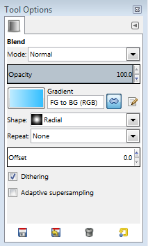
STEP THREE:
Look back at your blend options. It should look like this:
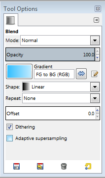
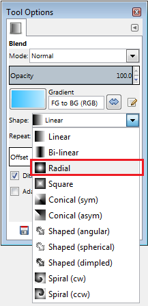
Change the shape to "radial"
And then, reverse it.
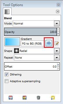
Your blend options should now look like this:
go back to your canvas and then click and drag! (make sure you start from around the center of your canvas)
make sure the line that forms isn't too long or too short.
But, it doesn't have to be perfect.
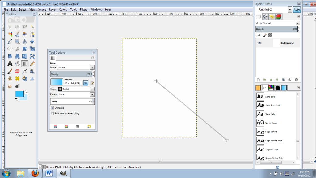
your canvas should look similar to this:

STEP FOUR:
Pull out the picture you are going to use.
Please make sure there is only one or two people in the picture, and please have them standing next to each other.
if you don't want to find your own picture, then use this: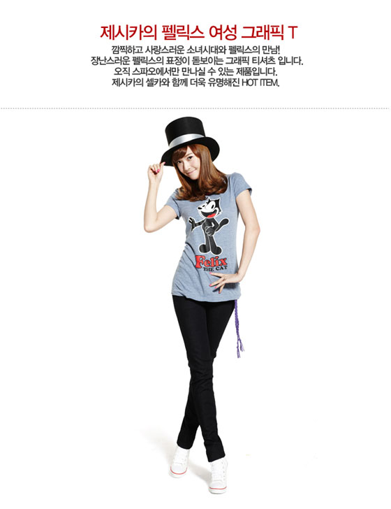
Go on ahead and render your picture. (i'm not going to do it for you!)
STEP FIVE:
Drag your rendered pic onto the canvas and scale it to size.

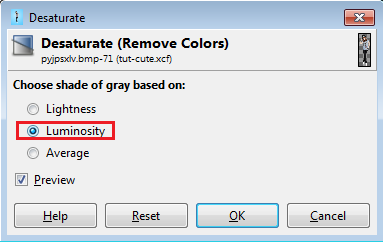
Then, desaturate your picture.
colors>desaturate
Choose luminosity.
Add curves, levels, etc to your picture to make it look nicer!
STEP SIX:
everything gets easy now~
Add your title!
Make sure you use the color white. (but if you really do not want to, you don't have to)
It just looks better white..
It's your choice on whether to put the text on the top, or bottom.
Then, if you have one, add your quote.
Here's how my poster looks like so far:

(i know it's messy... i'm lazy. :P)
STEP SEVEN (final step):
Make a new layer beneath the picture you used.
I'll let you guys be creative here~
Add brushes!
Make sure it's not too "all in your face"
Make it simple, and cute!
Once you're done with that, add credits and stuff,
Then, you're pretty much done!
Here's how mine turned out:

could be better. :p
PM me if you have any questions or something!
Thanks for reading through this tutorial!
I appreciate it. :)
show me your results! hopefully i'll be able to wallpost you feedback ^^
Tutorial By: b2utiful-day
GIMP INNOVATIONS 2012
Comments